After a dominant performance from Argentina and Denmark in the first half of the World Cup of kits group stage, the second half equally packs some surprises. Here’s an up-close look at kits from the next 16 countries taking part in Qatar, including a string of teams undone by their underwhelming away kits and what just might be the kit of the tournament so far.
 GOAL / various
The 2022 World Cup of kits: Group stages E-H - Japan excel as Switzerland fail to amaze
Group E
Home: 6/10
It's a pretty simple affair for Spain, with a "Power Red" home shirt with hardly any details on it. The secondary colours gain the shirt a couple extra points, including the navy trim and yellow detailing on the collar, crest and adidas' simplified logo.
Away: 7/10
The simplicity of Spain's home kit is contrasted with their away kit, which takes inspiration from art deco design. The sky blue shirt is covered with an abstract wave pattern and finished with adidas' Three Stripes in the colours of the Spanish flag. The final touch is the central crest in red and yellow.
Total: 13/20
 New BalanceShop the Costa Rica kit at New Balance
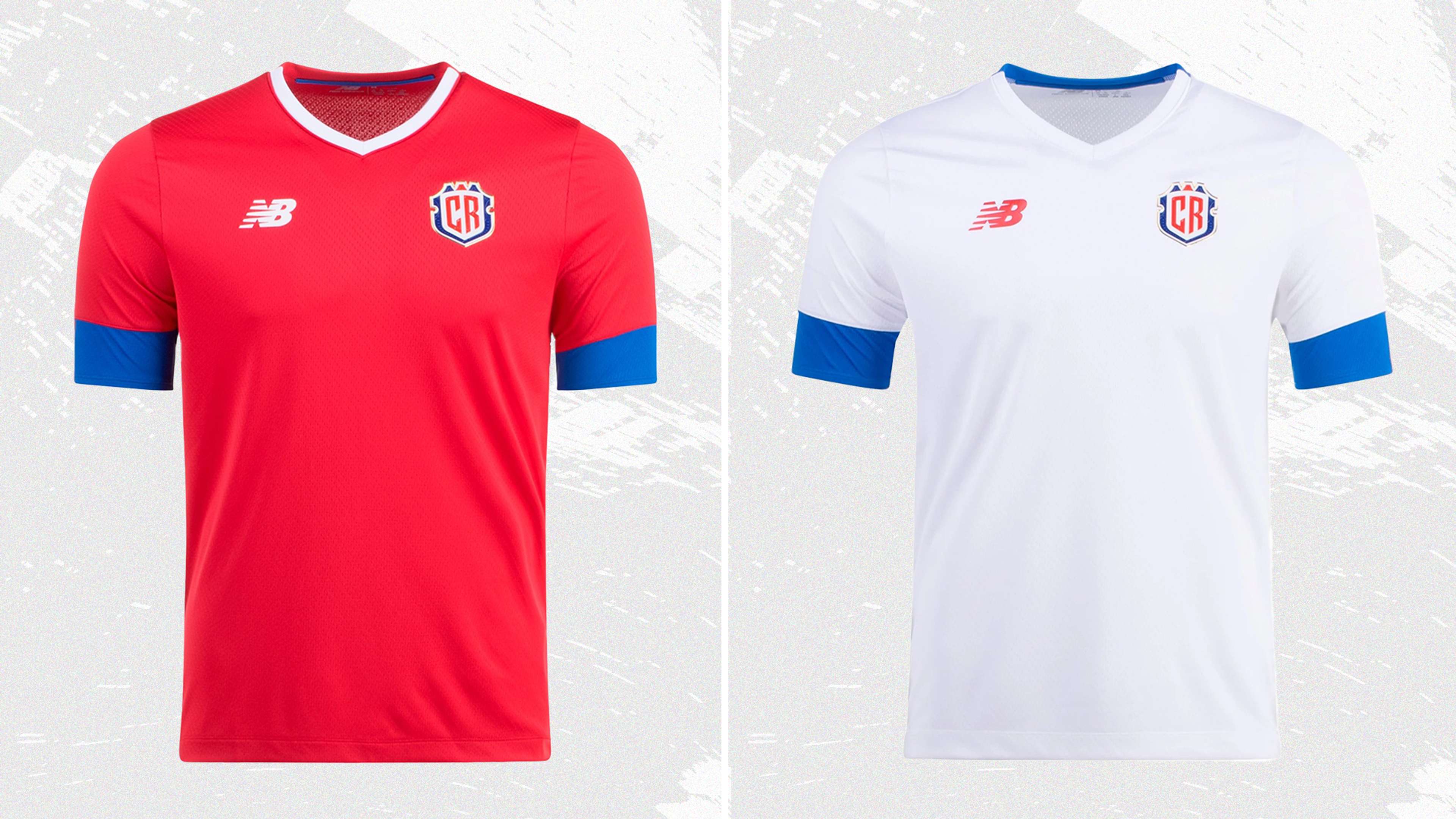
Home: 4/10
There is hardly anything to say about Costa Rica’s home shirt. It's plain red with thick blue stripes around each sleeve. All of Costa Rica’s World Cup appearances have featured pretty simple kits, but this is maybe the most basic of them all.
Away: 4/10
The away kit is equally as dull as the home, with white replacing red for the majority of the shirt, although the thick blue stripes return. In terms of kit, as well as actual football, Costa Rica has got a tough group, but it looks like they’re going out without putting up much of a fight.
Total: 8/20
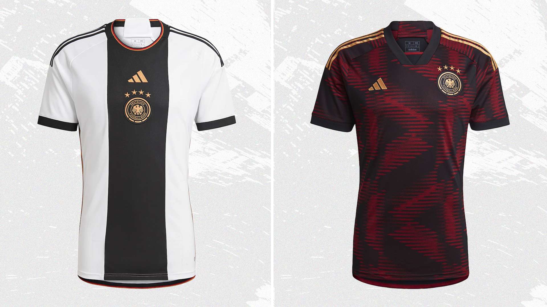
Home: 8/10
Germany has a history of great World Cup kits – in 1990 they had arguably the best two shirts ever worn at the tournament – and this is another strong effort. This shirt doesn’t quite reach those lofty heights, but the central black stripe, metallic gold detailing and the subtle trim in the colours of the German flag all contribute to a quality design.
Away: 9/10
While the home shirt is good, the away shirt is great. It is covered with an abstract pattern that is based on the D in Deutschland, which has then been blurred to create an eye-catching print. The colour combination is also first class, a black base finished with maroon and hits of gold.
Total: 17/20
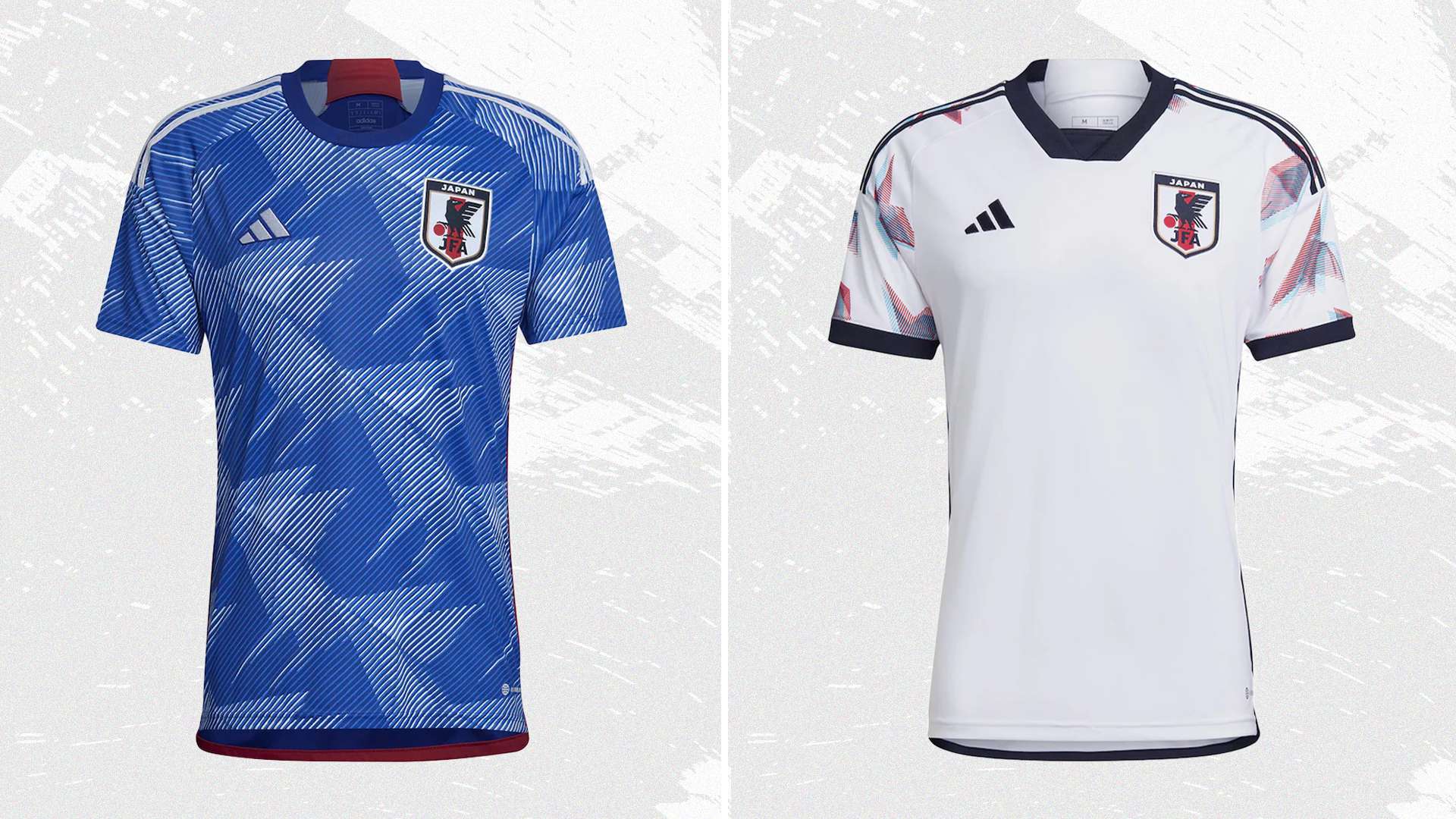
Home: 10/10
The Japan home shirt is probably the best shirt in the tournament, so they can expect to go far in the World Cup of Kits. It comes in the country’s signature blue colour, and is covered with a graphic representing origami cranes and the idea that creating 1000 origami models allows a wish to be granted. It goes without saying what Japan will be wishing for this year.
Away: 8/10
Japan’s away shirt continues with the origami metaphor, with colourful cranes across the shoulders. Other than that, it's pretty plain – a white base and black trim – but that allows the shoulder pattern to take centre stage. A strong showing from Japan across the two kits.
Total: 18/20
 GOAL / variousShop the winning Japan kit at adidas
Japan fly into the second round thanks to their origami-inspired designs, and the home shirt in particular. Germany’s efforts comfortably assure them of progression, but Spain are unfortunate to miss out. Costa Rica’s kits put them firmly at the bottom of the group.
Winners: Japan
Group F
Home: 6/10
After using the flame graphic on Argentina’s away shirt, adidas has returned to the pattern for Belgium. This time it appears on the two black sleeves, although it doesn’t add much to the shirt’s overall design. Away from the flames, it's pretty much just plain red with a black trim. Nothing revolutionary.
Away: 6/10
Belgium’s away kit follows a similar formula, taking a simple base and adding a small amount of colour. In this instance, it's a multicoloured pattern that's used as a trim, as well as for the adidas logo and Belgium crest. The design builds on Belgium’s collaboration with Tomorrowland and follows the same “LOVE” theme.
Total: 12/20
Home: 5/10
Both of Canada’s kits have come in for criticism ahead of the World Cup, with most of the outrage focusing on the decision not to release a new shirt for the tournament. Instead, they’re wearing the same plain red home shirt that they’ve been wearing in recent matches.
Away: 5/10
As well as being criticised for carrying over the kit, Canada has also received complaints over the understated designs. Similar to the home kit, the away shirt is plain, although this time, it comes in white and is finished with red details. It was a controversial design from Nike, but both home and away kits gain at least one point for the fact that they’re classic colours. Other than that, there’s not much to go on.
Total: 10/20
Home: 5/10
Morocco’s home kit is another that falls into the uninspiring category. The nation’s red and green colours are used, with a red base and a green band around the chest. Admittedly it's not bad, but it’s also nowhere close to Morocco’s kit for the 1994 tournament, which is rightly seen as an all-time classic.
Away: 6/10
The away shirt follows PUMA’s maligned template, with the country code appearing in the centre. Despite the issues with the design format, this is probably the best example of it, and the use of a more ornate ring and the green and red trim help to improve the design.
Total: 11/20
Home: 7/10
Croatia have an ace in the sleeve with their home shirts: those red and white checks. This isn’t the best example of it – 1998, if you’re interested – but it's still a strong design, with the fragmented approach to the checkerboard giving it a futuristic feel.
Away: 9/10
The away kit references 1998’s home shirt, with the checks only covering half of the chest. They arrive in Croatia’s traditional blue away colours, with a dark navy base and a brighter tone used for the checkerboards. It’s another classic from the 2018 runners-up, and it should see them safely into the Round of 16.
Total: 16/20
 GOAL / variousShop the winning Croatia kit at Nike
Group F is one for the true fans only, and the quality of the kits is generally low. Croatia storm the group with their two interpretations of the checkerboard, while Belgium pip the underwhelming Canadian and Moroccan entries to take second place and progress to the next round.
Winners: Croatia
Group G
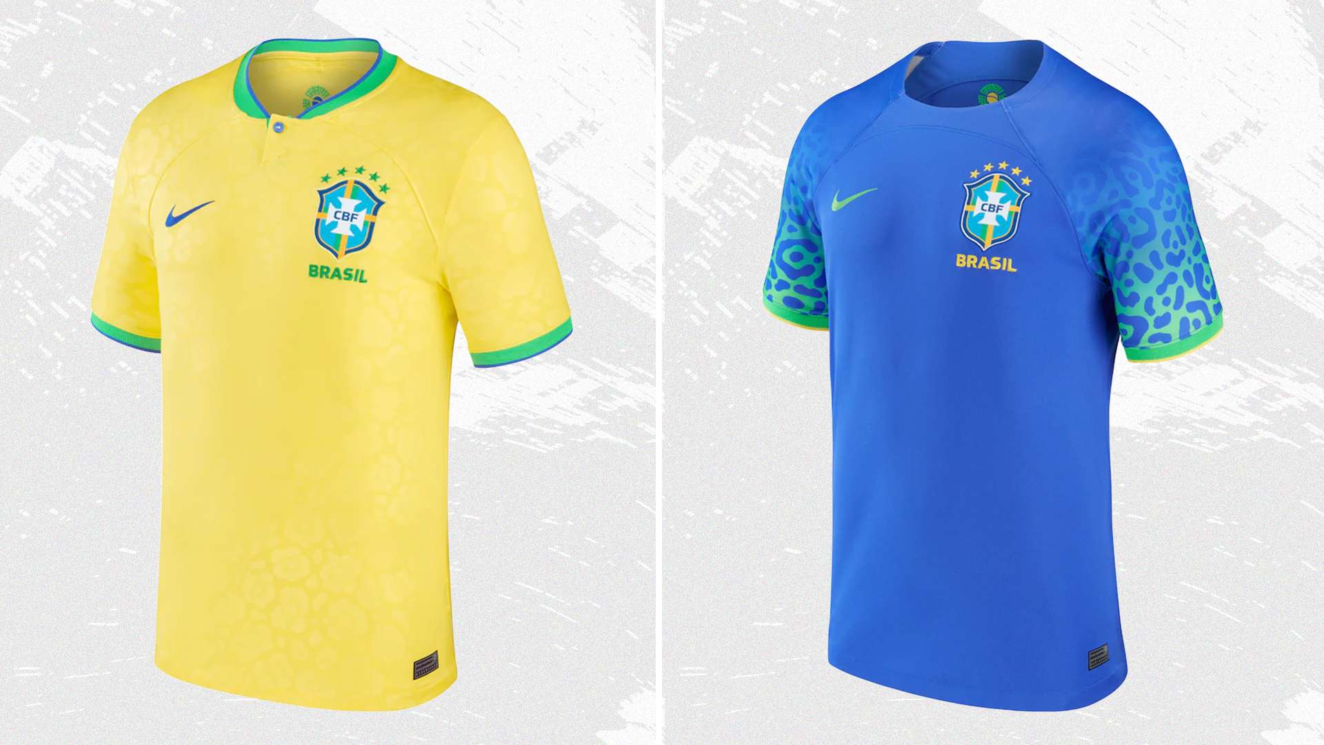
Home: 8/10
It can be hard to improve on a classic, and Brazil’s yellow and green is about as classic as it comes. This time, the iconic colour combination is complemented with a single button collar and a very subtle jaguar print pattern, referencing the away jersey.
Away: 6/10
While the home shirt is subtle with its jaguar motif, the away jersey puts it front and centre. It’s used in a Green Spark colour on each sleeve, fading away into the blue base. The design is inspired by the jaguars in the Amazon, but it ends up becoming a distraction on the away shirt.
Total: 14/20
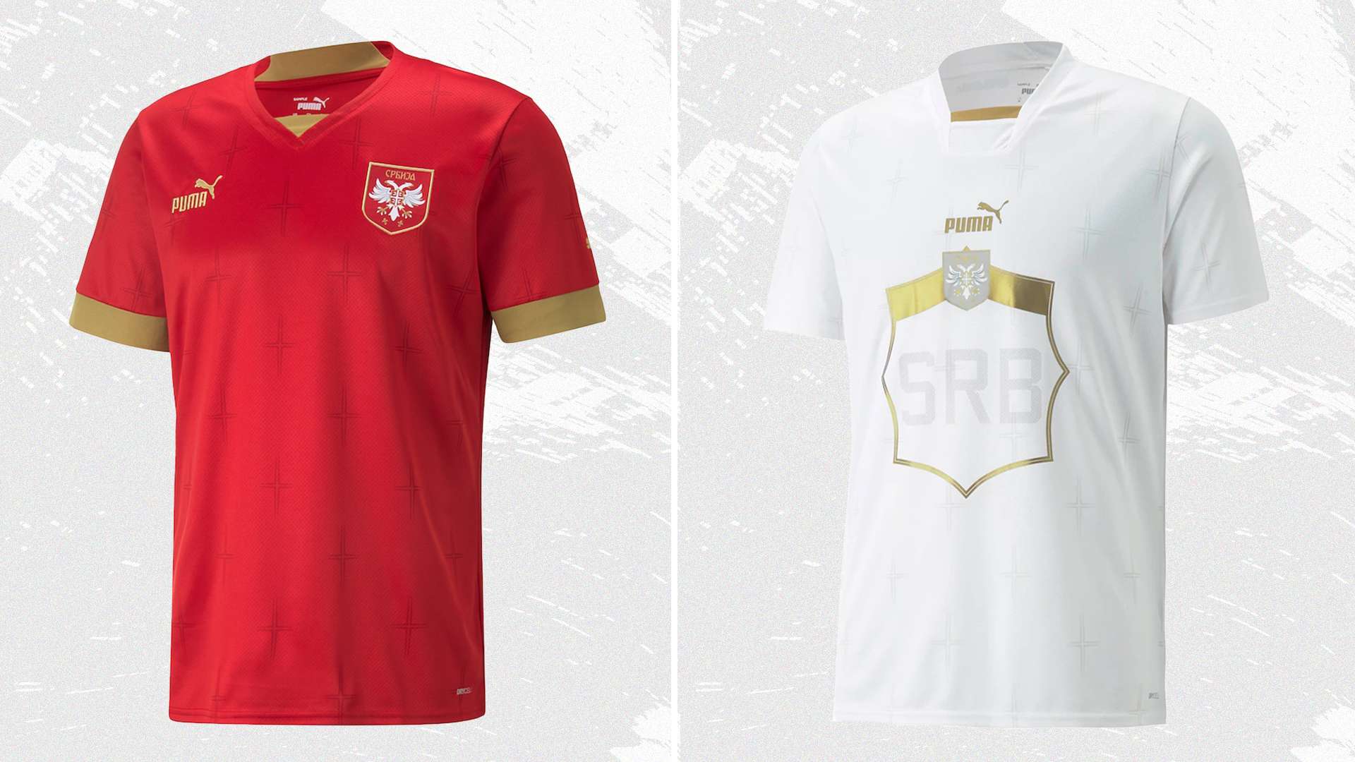
Home: 6/10
Serbia’s red and gold colour combination works well, with a nice finishing touch coming in the form of a subtle all-over cross pattern. Other than that, there’s not much to report. A solid but unspectacular home kit.
Away: 4/10
The away kit is yet another example of PUMA’s choice of template not working out. In this instance, the shirt is white, and the box in the centre is metallic gold. There’s not much to say about it other than that.
Total: 10/20
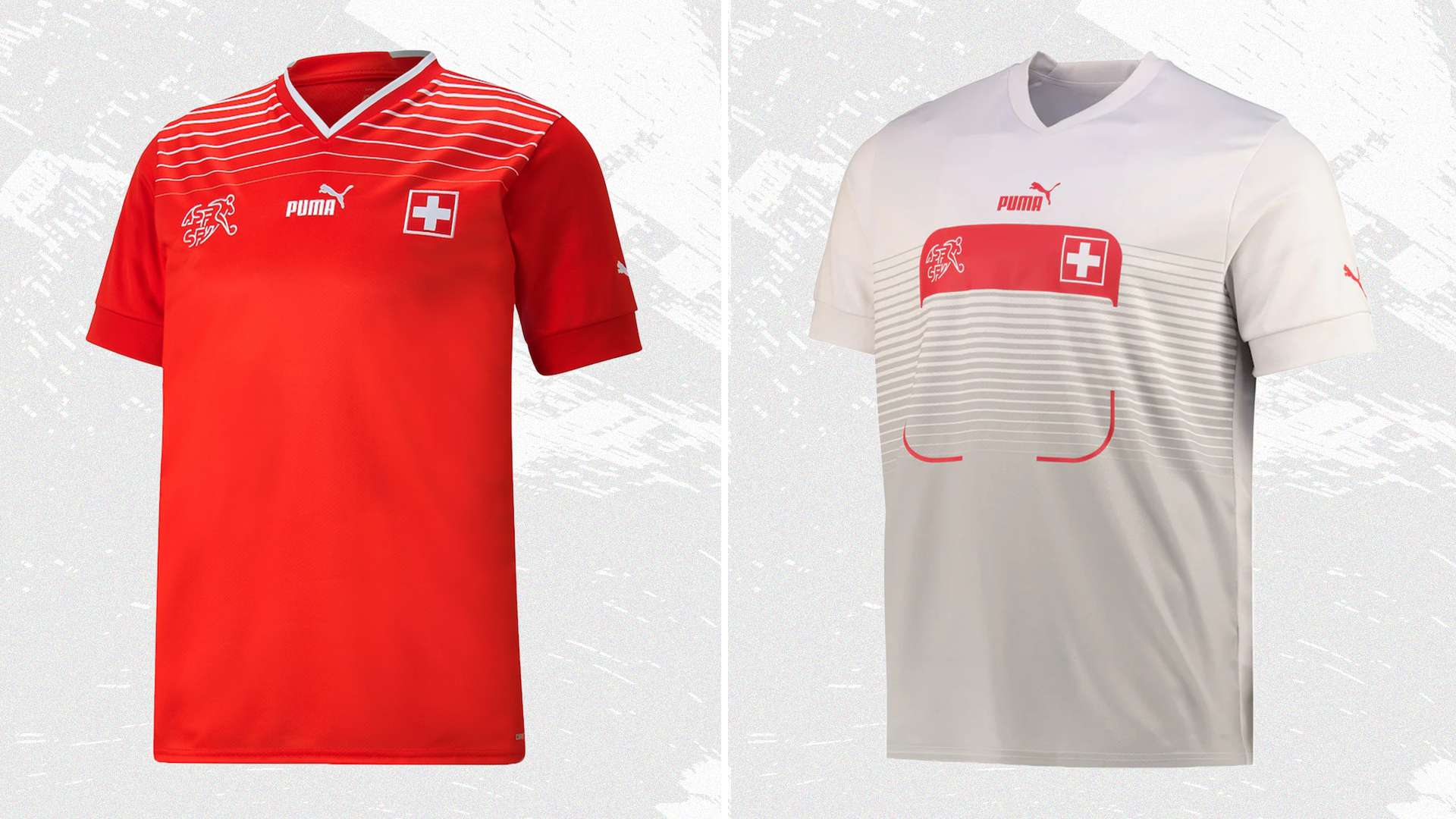
Home: 5/10
The Swiss home shirt is another solid design, with little distraction from its red base. The only detailing comes in the form of a gradient pattern at the top of the shirt, with white lines beginning just above the crest. It’s a nice touch.
Away: 3/10
The PUMA template has come in for a lot of criticism in the build-up to the World Cup, but this is probably the worst example of it. The huge red box in the middle looks like it should be a name tag rather than displaying the Swiss players’ numbers.
Total: 8/20
 Subside sportsShop the Cameroon kit at Subside Sports
Home 7/10
Cameroon are the king of World Cup kits, having worn some of the most controversial and innovative designs in the tournament’s history. This year they play it a bit safer, although it does appear to be covered with a ribcage-inspired pattern. The nation’s green, yellow and red colour palette is difficult to get wrong, though, and it still looks great here.
Away: 6/10
The rib cage returns on the away shirt as well, this time in a dark green against a white background. It’s exactly the same design as the home shirt, but this colour combination doesn’t work as well as the traditional home colours.
Total: 13/20
 GOAL / variousShop the winning Brazil kit at Nike
Group G is marked by two dud away shirts, consigning Switzerland and Serbia to elimination at the first hurdle. That allows Cameroon’s unconventional rib cage design and Brazil’s jaguar print shirts to make it through to the next round.
Winners: Brazil
Group H
Home: 7/10
For the first time ever, Portugal will be sporting a diagonal stripe at this year’s World Cup. The design – which brings to mind Monaco’s famous kit – splits a Pepper Red section at the top with a dark green section below. It’s finished with detailing in gold.
Away: 7/10
The red and green of the Portuguese flag, and the home kit, is also used on the away shirt. In this design, it makes up a thick stripe across the middle of the shirt, with the two colours separated by a slightly off-centre dividing line. This stripe contrasts against the muted off-white shirt with navy trim.
Total: 14/20
Home: 7/10
Ghana’s home shirt keeps things very simple, with hardly any adornment added to the white shirt. This simplicity allows the Ghanaian flag colours around each sleeve cuff to shine, making the who design of the shirt pop.
Away: 5/10
Once again, following the PUMA away shirt template, Ghana shows how it can be used to inject personality into the kit. The bright red base contrasts against the yellow of the central box, and a pattern in the colours of the Ghanaian flag is a nice touch.
Total: 12/20
Home: 8/10
Uruguay and PUMA have delivered the perfect example of what a Uruguay shirt should be. The shade of Celeste Blue is perfect, and the small additions – a single button collar, white sleeve cuffs and gold detailing – only add to the design. A real winner.
Away: 5/10
The away shirt isn’t as good as the home shirt, but it's not terrible, either. Following the same design as all PUMA away shirts at the tournament, the combination of white and light blue works well, and the collar and cuffs in particular are strong. That box in the middle still lets it down though.
Total: 13/20
Home: 8/10
The stand-out theme of the red and black South Korea home kit is a tonal tiger stripe motif around the shoulders. The design is inspired by the Dokkaebi, a creature from Korean mythology that has been chosen to represent the “fierce mentality” of the nation. Combined with the black collar and detailing, it all comes together perfectly.
Away: 9/10
While the colourful away shirt may not immediately recall the white, red and blue of the South Korean flag, the inspiration comes from the Taeguk symbol in the middle of the flag. That motif represents heaven (blue) and earth (red). Both colours are used on the away shirt alongside hits of yellow in a graffiti-style. It's one of the most eye-catching designs at the tournament and will go down as a World Cup classic.
Total: 17/20
 GOAL / variousShop the winning South Korea kit at Nike
South Korea easily progress into the second round on the back of their strong home and away showings, but it's a tight race for second place. In the end, Portugal just about edge out Uruguay and their elegant home kit, and Ghana take last place in the group.
Winners: South Korea

