This page contains affiliate links. When you purchase through the links provided, we may earn a commission.
2022 World Cup kits ranked - Groups A-DGOAL / various

The 2022 World Cup of kits: Group Stages A-D - The USA crash out as Wales roar

We independently choose all products featured on our site. We may earn a commission when you purchase something through the links provided.

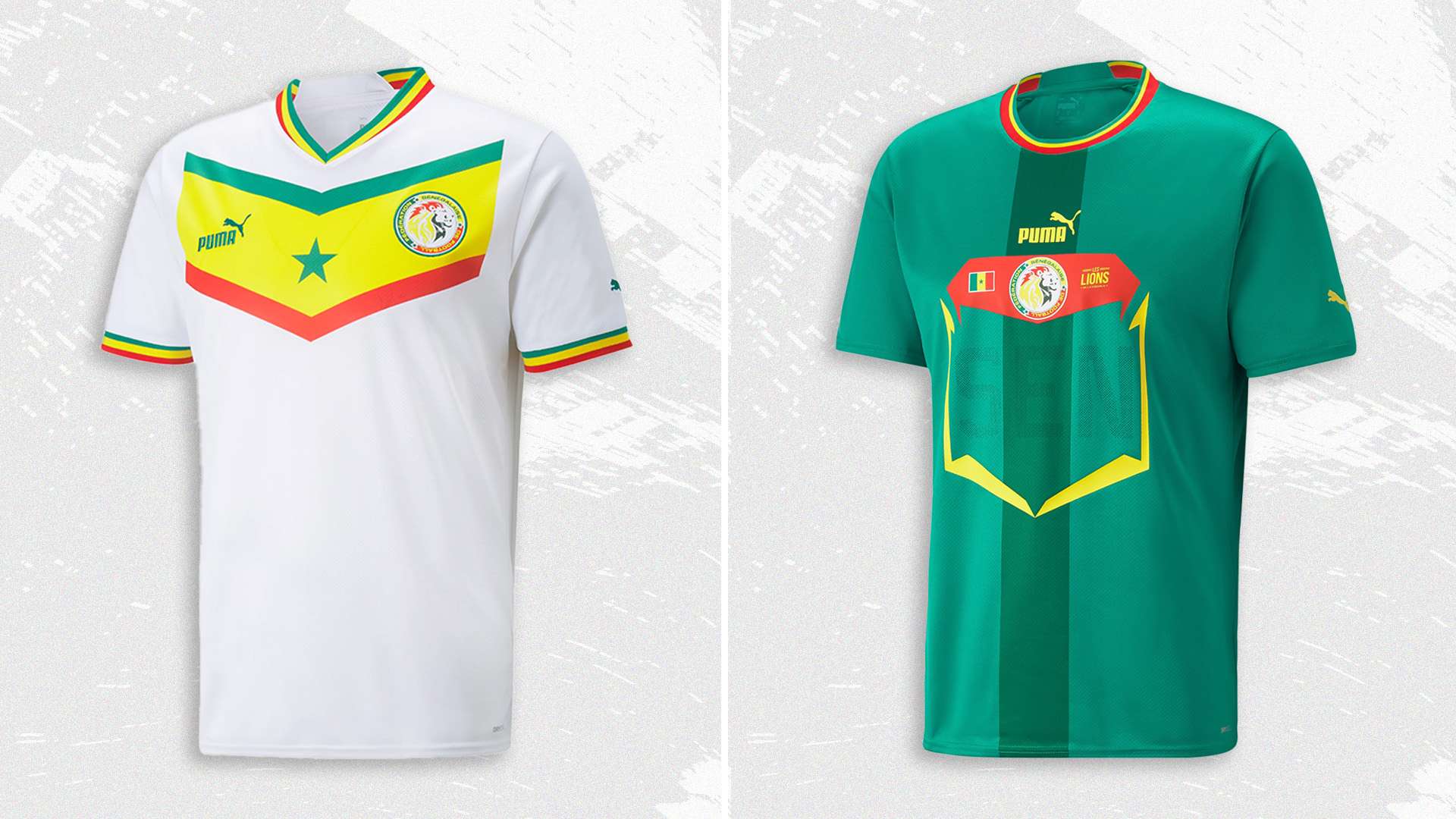
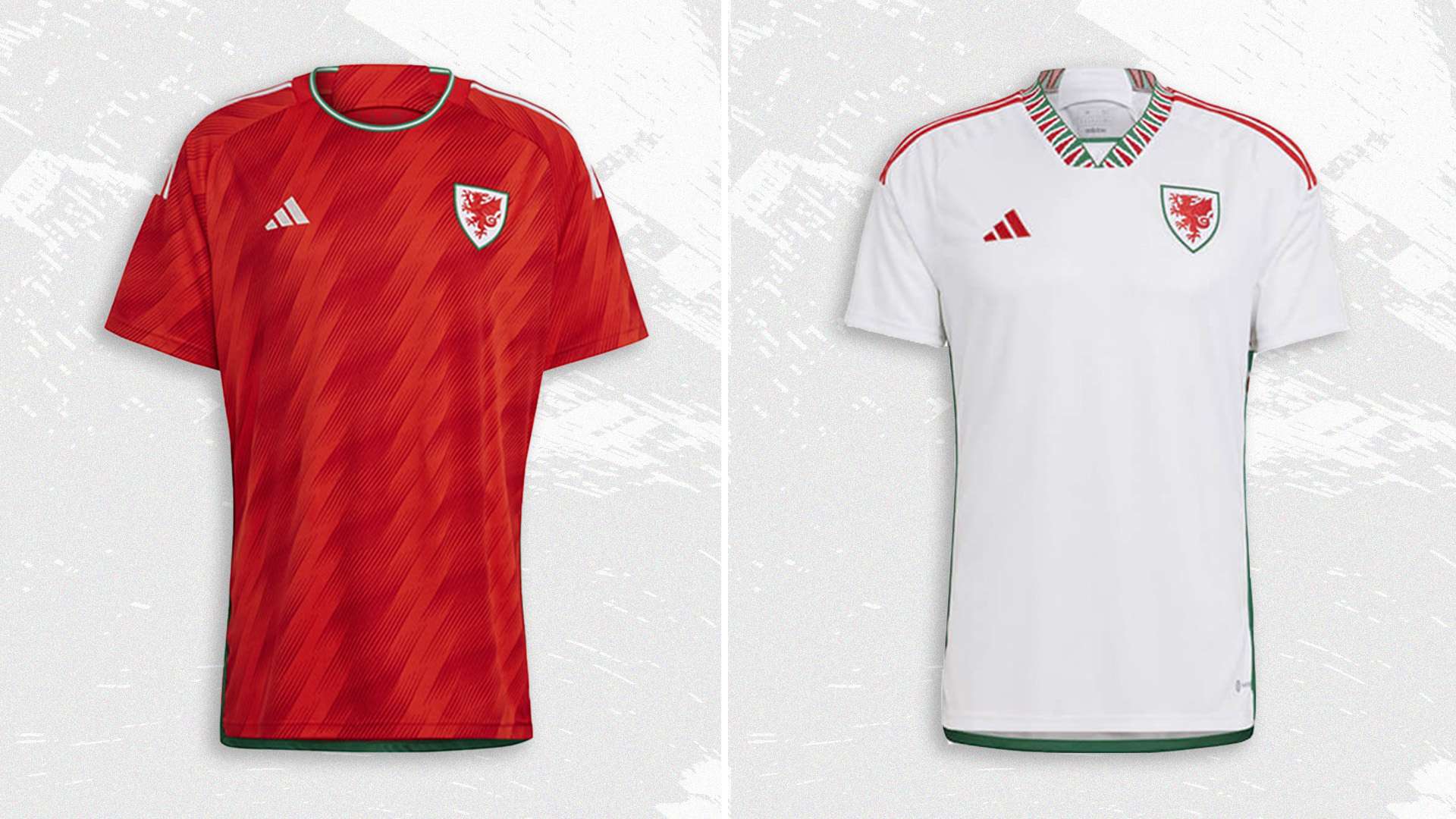
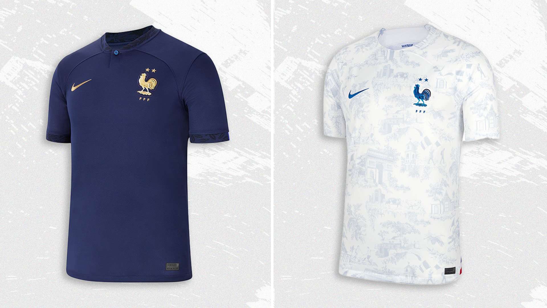
Before the first World Cup held in an Arabic country kicks off, we’ve taken an in-depth look at every home and away shirt in the tournament to come up with a decisive winner for our replica Jules Rimet trophy wearing a Nigeria 2018 kit. 

First up, group stages A-D, and it’s bad news for the USA, we’re afraid...

To see how South Korea, Portugal and Brazil rank in the kit tournament so far, head to The 2022 World Cup of kits part two: Groups E-H.

  • Group A

    Home: 6/10

    Host nation Qatar keeps things fairly simple for its first-ever World Cup home kit. The majority of the shirt arrives in maroon, the same colour as the country’s crest and the majority of its flag. The only detailing is a white pattern around each sleeve, a nod to a similar design that runs across the flag. It’s a solid, if unspectacular, way to begin the World Cup.

    Away: 7/10

    The away shirt pushes the boat out a little further. Contrasting the maroon, it arrives in an off-white – taken from the other section of the flag – and is finished with an overlapping gold and beige geometric pattern. The pattern helps to elevate the design into something more interesting and is inspired by the Qatari coastline and the national tradition of pearl diving.

    Total: 13/20

  • Advertisement
  • Home: 5/10

    Once you get past the novelty of seeing a Marathon-designed kit at the actual World Cup finals, the averageness of Ecuador’s home shirt becomes clear. The bright yellow base is strong, and works well with the navy accenting, but overall it fails to inspire much belief that Ecuador will match their best-ever performance, when they made it to the Round of 16 in 2006.

    Away: 8/10

    The away kit is a different story, though. The dark navy base is covered with a lighter blue pattern, apparently a nod to the Incan civilisation who once resided in Ecuador. The design is improved with the use of metallic silver for the accenting, and the very-subtle Ecuadorian flag appearing halfway round each sleeve.

    Total: 13/20

  • Home: 6/10

    Senegal have a checkered World Cup history, reaching the quarter finals in 2002 and being eliminated due to fair play in 2018. Their 2002 home kit remains one of the all-time best, and this year fails to hit the lofty heights set 20 years ago. The stand-out feature of the white is the huge chevron across the chest, displaying the colours of the Senegalese flag.

    Away: 4/10

    PUMA have a history for following a template too closely – just think about those 2020/21 third kits – and this year’s World Cup away kits follow a similar formula. For Senegal, that means a green shirt with a darker central stripe, so far so good, is finished by a box featuring SEN on the front.

    Total: 10/20

  • Home: 8/10

    The Netherlands have an unfair advantage, with their traditional bright orange being one of the world’s best kit colours. This year, they’ve adorned it with an abstract pattern in a lighter Laser Orange. The two-tone result brings to mind some of the great kits from the Netherlands archive, which they hope will inspire the team to their first-ever World Cup triumph.

    Away: 6/10

    The away kit is a much safer affair, sticking to the Nike template seen across Europe this season. The base of the shirt is listed as Deep Royal and is finished with black sections around the neck. The stand-out feature, though, is the use of Habanero Red for a hit of colour around each sleeve. It just about manages to save the kit from being plain boring.

    Total: 14/20

  • Group A might have seemed like a pretty straightforward affair, but the kits have helped to complicate the matter. In the World Cup of Kits, the Netherlands progress easily into the Round of 16, topping the group and therefore getting an easier draw next round. It's a tight race for second, with Qatar delivering a better-than-expected performance before Ecuador edge them out due to the strength of their away kit.

    Winners: Netherlands

  • Group B

    Home: 5/10

    Another kit that sticks too closely to Nike’s controversial template, the saving grace of England’s home kit is the colour combination. Obviously, it’s a mostly white shirt, but the addition of a blue gradient around the collar and tonal blue stripes on each sleeve gains the shirt an extra point. The different shades of blue also bring to mind some of England’s much-loved '90s designs.

    Away: 9/10

    A rocky start with the home kit, but England manage to pull it back with their away shirt. It’s the first time England has worn a red away kit since 2018, but the design looks much further back than that. The dark navy collar – complete with light blue detailing – gives the shirt a very welcome likeness to the 1992, 1994 and 1998 away kits.

    Total: 14/20

  • Home: 6/10

    Iran were the last country to unveil their World Cup kits, giving fans just over a week to get acquainted with them. They’re both pretty solid, and the home shirt mixes an all-white base with an Iranian cheetah pattern on each sleeve. The key detail, though, is the Iranian flag which runs around the collar and sleeves.

    Away: 6/10

    The Majid-made shirts both use the same template, and the Iranian cheetah motif returns on the away kit. This time, though, the shirt arrives all in red, while the red, white and green flag returns for the shirt’s trim.

    Total: 12/20

  • Home: 4/10

    Arguably the most controversial kits at the 2022 World Cup come courtesy of the USA. Both the home and away kits drew immediate criticism from the country’s fans for very different reasons. For the home shirt – white with navy and red accenting, naturally – the main critique was how safe Nike and the USA had played it.

    Away: 5/10

    The away shirt was criticised for another reason, with fans not being happy with the tonal blue tie-dye effect chosen by Nike. Despite its controversy, it deserves an extra point for its slighty similarity to one of the all-time great World Cup kits: the USA’s denim away shirt in 1994.

    Total: 9/20

  • Home: 8/10

    Wales and adidas have managed to tweak their traditional red shirt just enough for the country’s second-ever World Cup. The shirt is covered with tonal diagonal stripes that manage to add a new dimension to the shirt without ruining the classic formula. As with all its kits for the tournament, adidas also adds its stripped-back new Three Stripes logo.  A job well done.

    Away: 8/10

    The away shirt takes a slightly different approach but it ends with just the same result. In this instance, an all-white base is covered with red detailing – including that stand-out adidas logo again – and a green stripe down each side. The key feature, though, is the collar, which integrates the red and green into a new geometric pattern.

    Total: 16/20

  • Straight from the off, Group B reveals itself as a two-horse race, and it's England and Wales who progress into the round of 16. For England, they’re saved by their away kit after a poor showing at home, while Wales top the group thanks to two of the tournament's strongest kits.

    Winners: Wales

  • Group C

    Home: 7/10

    Argentina are another team who benefits from having an already-iconic kit. This year, they’ve stuck to a tried and tested formula – on the front, at least. The reverse of their home kit features two large stripes and two much smaller ones designed to replicate the Argentinian flag. Other detailing includes a smart black trim, a gold sun on the neck and a subtle pattern running up each stripe.

    Away: 10/10

    If the home kit is a classic formula for Argentina, the away kit is anything but. The majority of the shirt arrives in Legacy Indigo, with the lower portion then covered in a huge flame motif that makes it look like something Guy Fieri might wear – in a good way. Other features, including a Purple Rush trim and that minimalist adidas logo again, help to perfect the design.

    Total: 17/20

  • Home: 6/10

    Saudi Arabia stick to their traditional green and white colours – the classic white base and green trim – but add a subtle detail to take the kit one step further. The shirt is covered in a tonal palm leaf pattern, which was previously seen on the nation’s 2020/21 away shirt.

    Away: 8/10

    While the home shirt used a previously-seen pattern, the away shirt is a lot more inventive. The classic dark green base returns, although this time it's adorned with an all-over pattern in a lighter tone. Finishing off the design is a tiny white palm tree on the back of the neck.

    Total: 14/20

  • Home: 7/10

    Mexico’s home shirt for the upcoming World Cup introduces an eye-catching new motif without distracting from the traditional green jersey. The shirt is adorned with a graphic pattern in a slightly darker shade of green. The geometric design is inspired by Quetzalcoatl, the Mexican god of wind, who is also the patron of priests and inventor of calendars and books in Mexican culture.

    Away: 9/10

    The away shirt starts with an off-white base, but it's the all-over red pattern that puts it on the path to being a World Cup classic. The design is inspired by Mexican cultural icons, which have been combined to form an Aztec-style pattern in a dark red tone. If Mexico can go on a run at this year’s tournament, then this shirt will cement its place in World Cup history.

    Total: 16/20

  • Home: 5/10

    It’s not a bad home kit from Poland, but nor is it particularly good. Following Nike’s template for the season, a plain white base is offset with a different section across both shoulders. On this shirt, it’s a grey and white pattern. It's straight down the middle from Poland.

    Away: 6/10

    The away shirt is equally as simple but somehow works even better. It's almost entirely red, with the perfect shade used to create a bold statement. The only detailing is subtle white lines around each sleeve and the collar. All in all, not bad.

    Total: 11/20

  • Group C turns out to be an unexpected group of death, but in the end, it’s the flame print of Argentina and Mexico’s Aztec designs that see them through to the next round. As well as assuring them of World Cup progress, both kits look like they could cement their status as all-time classics.

    Winners: Argentina

  • Group D

    Home: 8/10

    France plays up to the fact that they are the reigning world champions through metallic gold detailing across the shirt. Combined with the colour – Midnight Navy, if you’re wondering – and the use of the single button collar, though, the gold accents help France and Nike refine an otherwise-classic shirt.

    Away: 8/10

    Less simple and more ornate than the home shirt, France have covered a white base with detailing in Game Royal for a pattern inspired by the French toile de Jouy. The imagery incorporates a number of iconic French motifs, from the Arc de Triomphe to the cockerel logo, to create a subtly patriotic away shirt.

    Total: 16/20

  • Home: 7/10

    Australia’s gold and green colours always work well, but Nike have added a tonal yellow pattern to help take it to another level. Other than that, it’s a pretty standard affair, with the green appearing around each sleeve and on the team branding.

    Away: 4/10

    The away shirt, on the other hand, is a swing and a miss. Unlike the home kit, the colour combination – this time of navy and teal – doesn’t work, while the lack of any other motifs makes it too basic. All in all, the Australia away kit ends up looking more like a training shirt than anything else.

    Total: 11/20

  • Home: 9/10

    Denmark decided to make a statement with its World Cup shirts, releasing designs with no visible crests or logos to make a statement against Qatar’s human rights record and the deaths of migrant workers during the buildings of the stadium. For the home shirt, they will wear their classic red colour, although the usual white detailing is lost.

    Away: 9/10

    The away shirt follows the same format, and principle, with an all-white shirt and all crests, logos and branding kept to a minimum. Denmark and Hummel also released a third shirt in all black, chosen as it is the “colour of mourning.”

    Total: 18/20

  • Home: 7/10

    Tunisia may be expected to finish bottom of their difficult group, but their kits show that they’re taking this tournament seriously. The home shirt arrives in red, complete with a white trim and a large graphic inspired by the “Armour of Hannibal” which was found in 1909 and reportedly worn by the legendary Catharginian soldier nearly 2000 years ago.

    Away: 7/10

    The away shirt features the same graphic, reversing the colours so the white base is finished with a red trim. Kappa and Tunisia also released a third kit featuring the same design, although this time using a colourway inspired by the country’s famed olive oil industry.

    Total: 14/20

  • Tunisia took this group further than anyone expected, comfortably eliminating Australia but falling just short of qualification for the next round. In the end, France’s gold trim and toile de Jouy guaranteed second place, behind Denmark’s powerful statement.

    Winners: Denmark