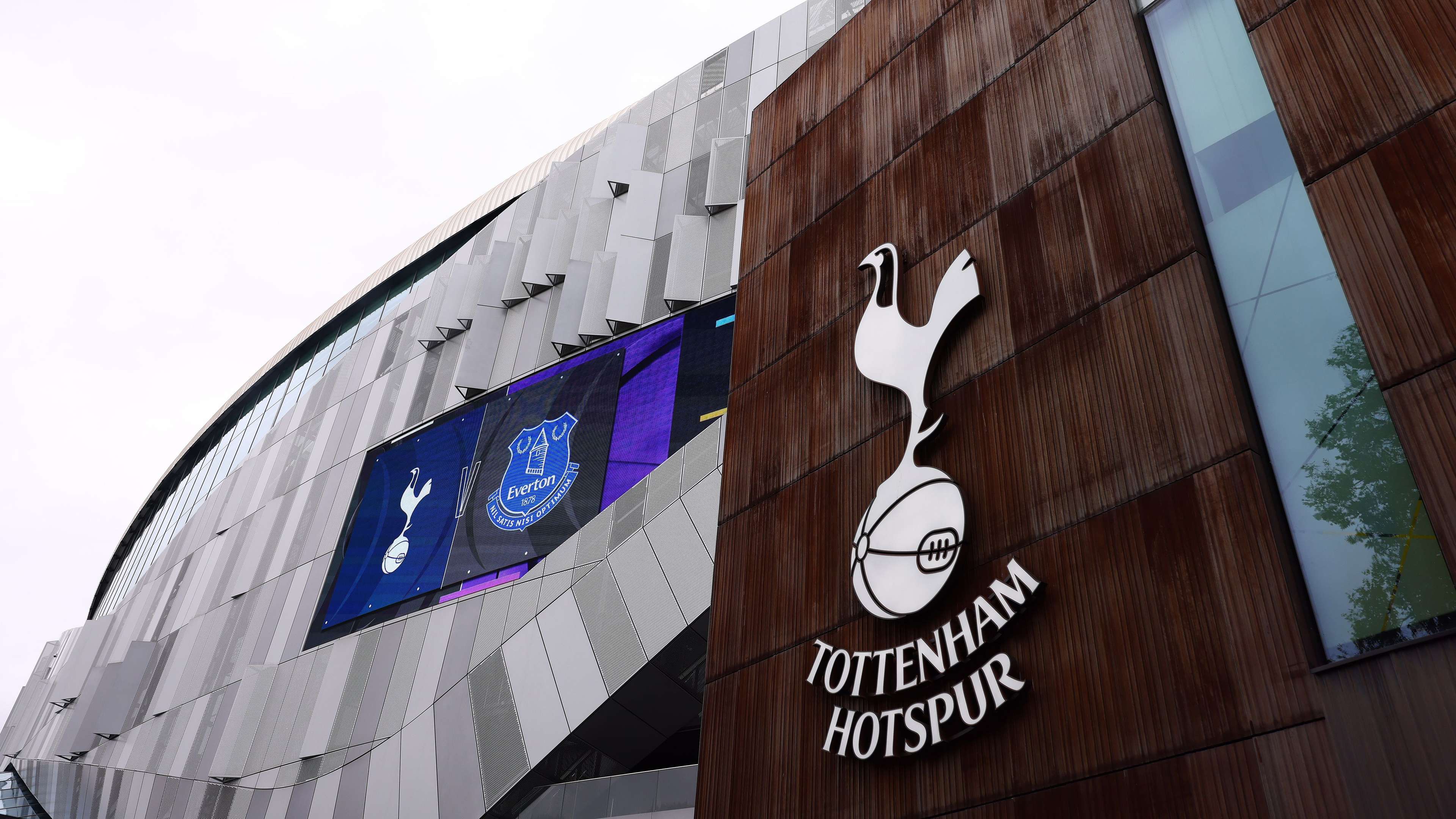
'What on earth are you doing?' - Spurs fans left stunned by 'embarrassing' logo redesign as they question whether club are playing a 'prank' on supporters
On Monday, Tottenham unveiled their "reimagined" cockerel crest, with the club saying this embraced their "rich history and unmistakable heritage". The new version has removed the words "Tottenham Hotspur" and the logo size appears to have increased. But fans on social media were not impressed.
Advertisement
WHAT THE FANS ARE SAYING
@ParkLaneBlock40 posted on X, formerly Twitter: "What on earth are you doing? It’s our Club, not yours."
@RawrEWreckz tweeted: "This is so embarrassing. Why are we always being embarrassed? Why do yall put us in this position? To dare is to do" and we dared to do nearly nothing in a brand re-do???"
@thfcem28 commented: "How about win a trophy and live up to the badge?" and @bridagul put: "Can you remaster the wage bill?"
@ImBillRay added: "Looks exactly the same, is this a prank?"
Getty Images
THE BIGGER PICTURE
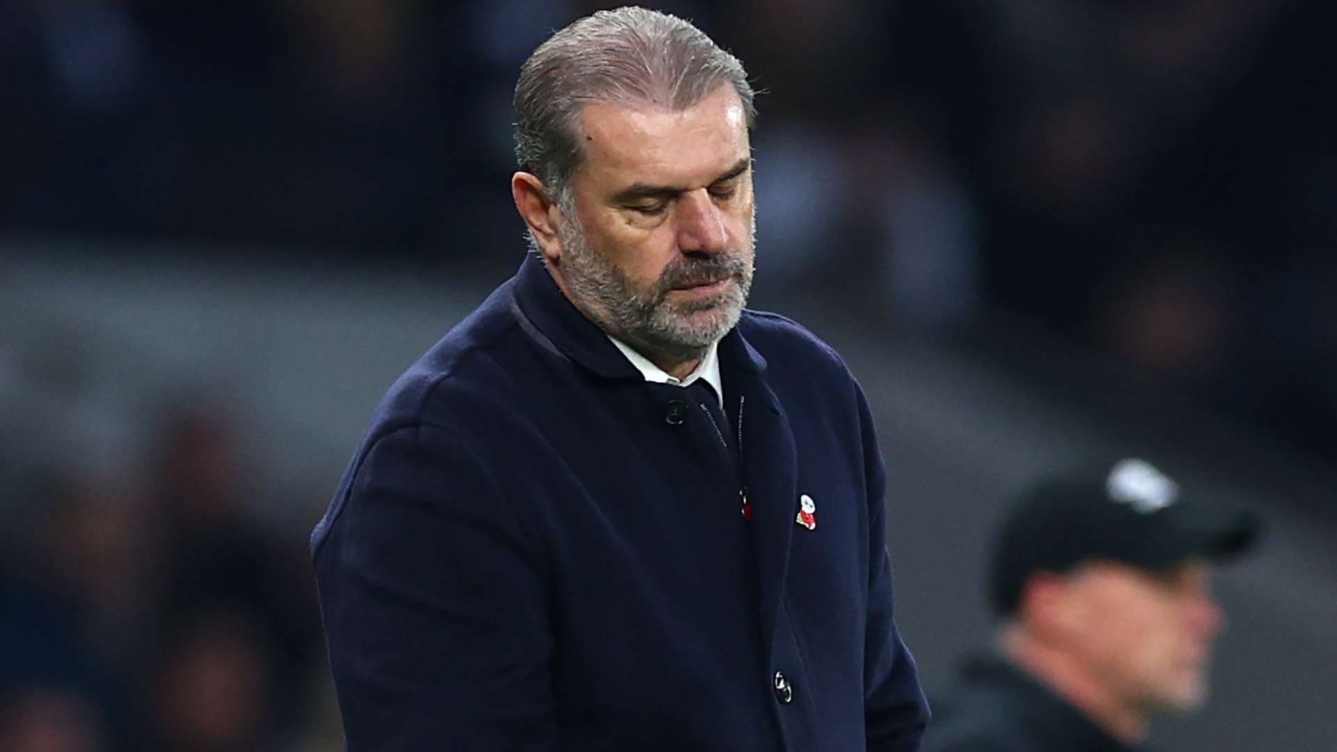
This seemingly unpopular move comes at a time when Tottenham are struggling in the Premier League and head coach Ange Postecoglou is under mounting pressure. They are 10th in the division but are just three points off the top four. However, they can't afford to lose more ground to their rivals in their bid to qualify for the Champions League next season.
ENJOYED THIS STORY?
Add GOAL.com as a preferred source on Google to see more of our reporting
Things may not get much easier for Spurs as they take on defending Premier League champions Manchester City at the Etihad next Saturday. However, after four-straight defeats for Pep Guardiola's side in all competitions, this may be a good time to play City.