Goal.com
Live
+18 or +21, depending on state | Commercial Content | T&C's Apply | Play Responsibly | Publishing Principles
This page contains affiliate links. When you purchase through the links provided, we may earn a commission.
MLS Kit RondoGOAL

The Rondo, MLS 2026 kits review edition: Have FC Dallas put together a classic? Did Lionel Messi's Inter Miami play it too safe? And what is the kit of the year?

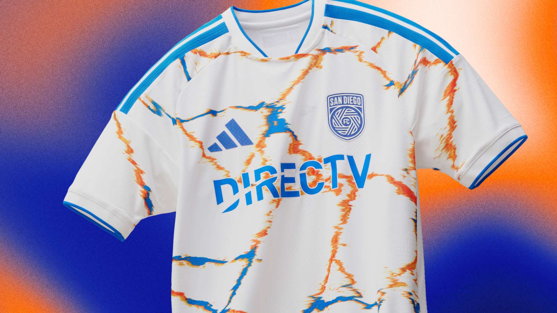
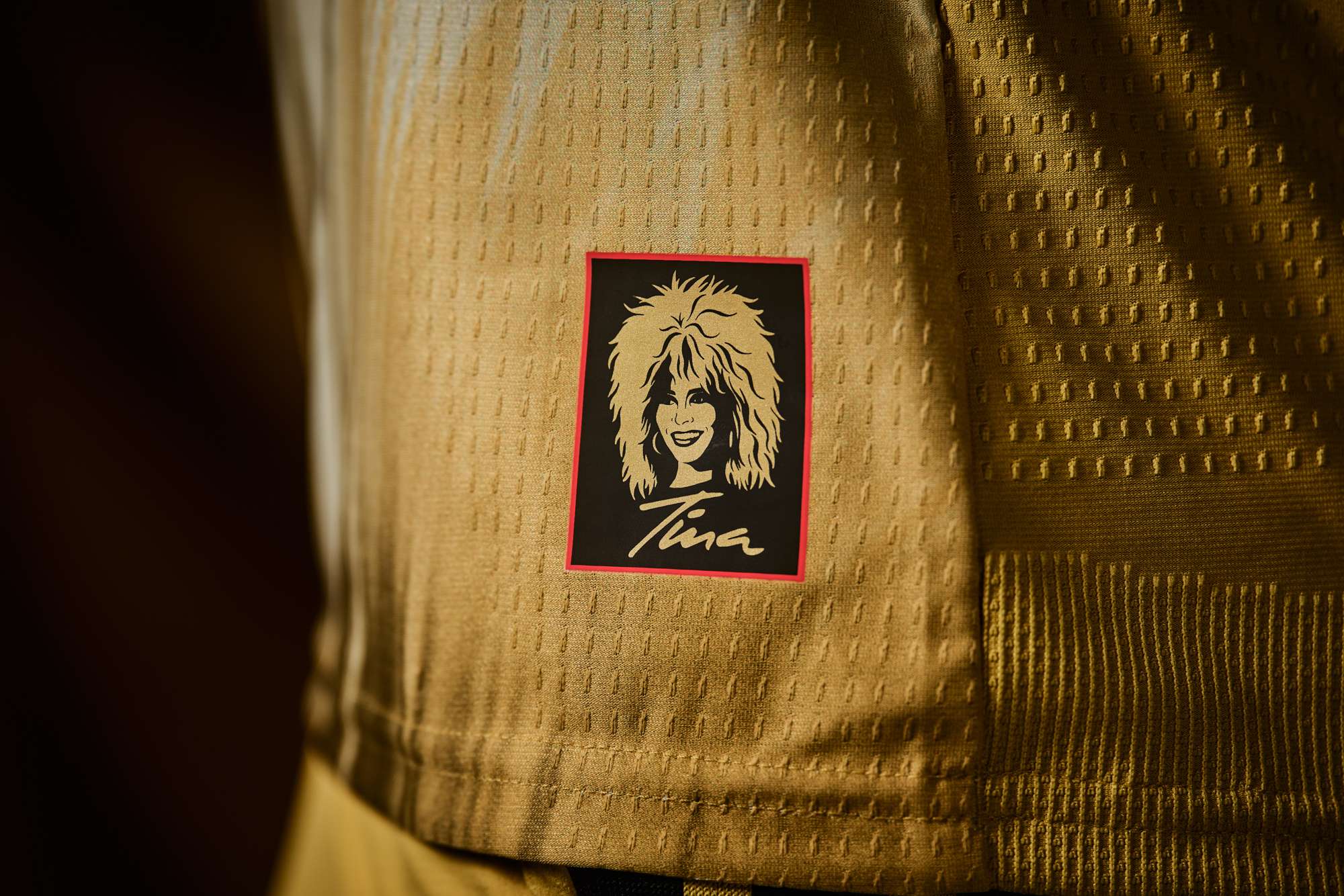
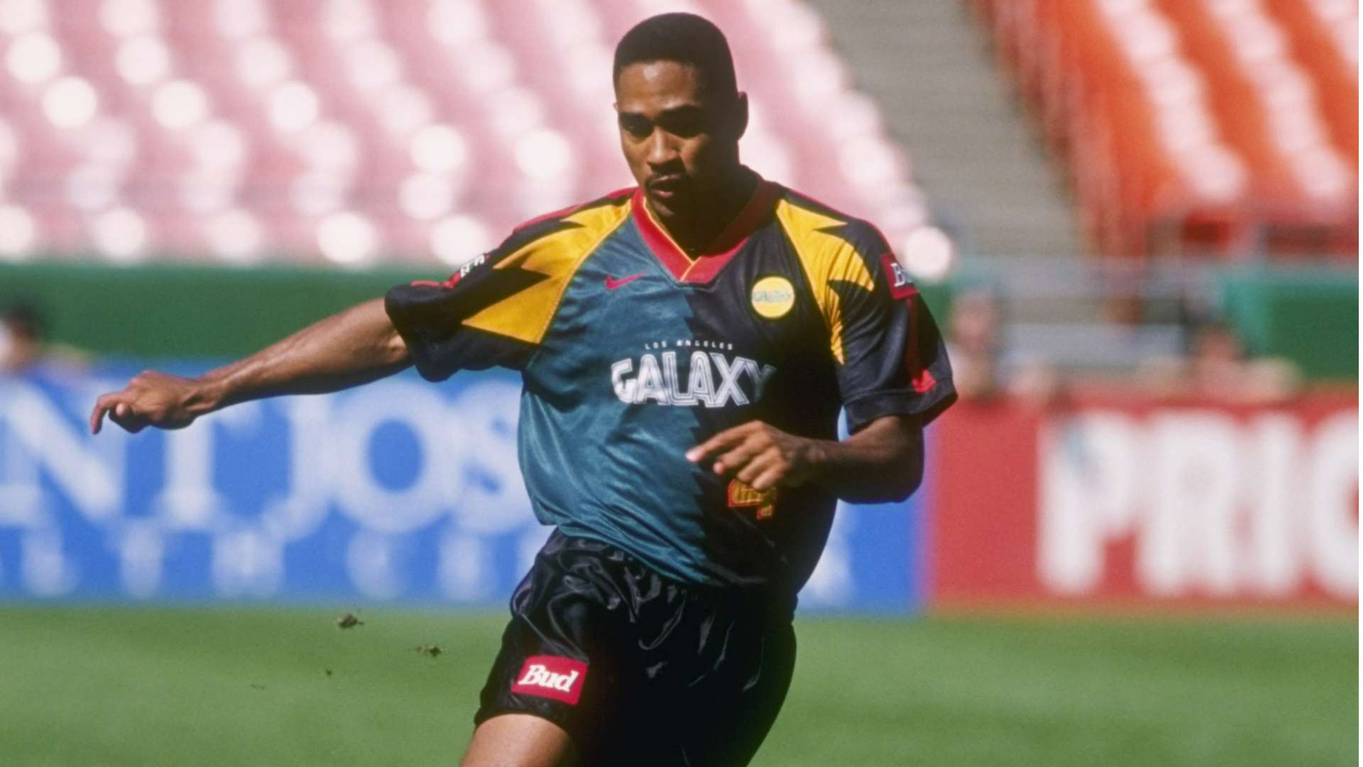
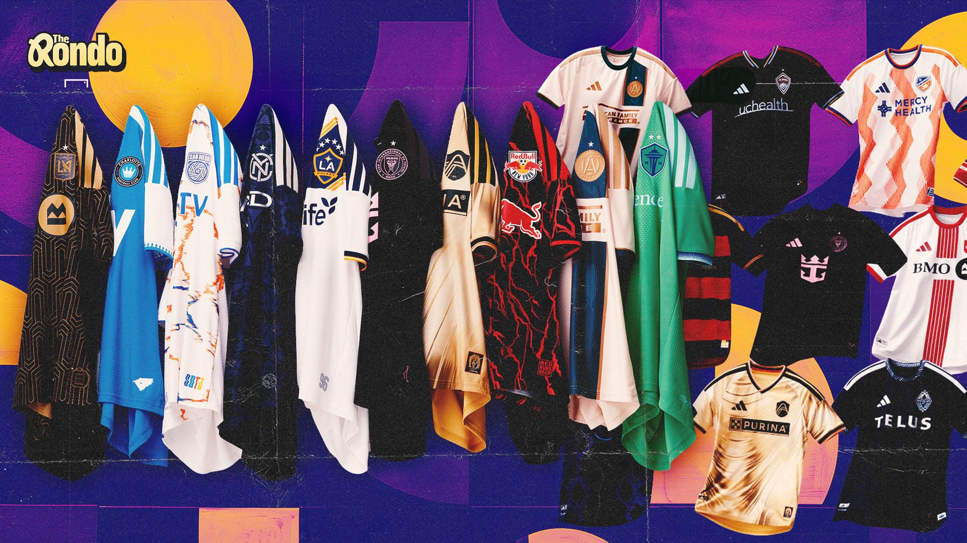
Let's talk about kits. MLS has upped its game of late. A few years back, it seemed like teams played it safe. There were, let's be honest, a fair few T-shirts that guys happened to show up in to play soccer. But now, nostalgia is back. And with it comes a penchant to take a bit of a risk. These days, we care about patterns, cool fonts, playing around with logos - all of that stuff. 

This year is no different. We have jerseys with hoops. We have tie-dye kits. We have, for some reason, an Art Deco vibe to the LAFC kit (and it works!). 

The experimentation has led to a few misses. But so what? That's what all of this is about. Some of these strips will go down in history. Others will age like milk. But if you never try, you never know. And GOAL writers, who are well-equipped to talk fashion, are breaking all of the new jerseys down in another edition of... The Rondo.

  • LAFC Kit 2025Major League Soccer

    What is the best MLS kit this season?

    Tom Hindle: Shoutout LAFC, who took the already slick Black and Gold thing, and made it cooler with a fun sort of art-deco pattern. Well done, lads. 

    Ryan Tolmich: As a sucker for hoops, shoutout to FC Dallas, who absolutely nailed it.  A side shoutout to Real Salt Lake, who also did well with their hoops, but Dallas' kits are just that tad bit better. It's a kit that is wearable both on the field and in everyday life, which is exactly what you want from these, right?

    Alex Labidou: This is a tough one. There were really four standouts: Philadelphia, St. Louis (more on this one later), the New York Red Bulls, and FC Dallas. Dallas’ kit is classic fire, but let’s give this one to the Union, whose kit clearly weaves Philly’s history, culture and sports somehow in one bold kit.

  • Advertisement
  • San Diego FC kitMajor League Soccer

    What is the worst kit?

    TH: Nashville, by some distance. Why oh WHY is the Adidas logo bigger than the club badge? Annoying and a little tacky, to be frank. 

    RT: San Diego's kit may look nice on the field, but it just isn't one you can really mix into the everyday rotation of wearing for fashion. Not every kit needs to be worn in Milan, of course, but this is one largely made to be worn only in San Diego by those in the stands supporting the team.

    AL: There were at least 10 uninspired kits in this year’s crop, but the two that stand out the least are, unfortunately, Colorado’s and San Diego's. 

    For the Rapids, this is a bit of a surprise. Colorado usually drops fashionable bangers year after year, regardless of whether or not the team is actually good. Who could forget the New Day or Headwaters kits? This could be a case where the kits need to be seen on the pitch as opposed to the renderings and photos given, but based on what we have, the black kit with neon colors is blinding on my screen. 

    And San Diego, it's more of the same. For a club that has largely gotten everything right since its launch, unfortunately, apparel isn’t one of those things. This year’s kits look like ChatGPT designed them - it feels like the city of San Diego if it didn’t have beaches and sun. Usually, expansion franchises, especially one as popular as San Diego, come out with bangers. Adidas, please hook up The Azules with a vibe next season.

  • Tina Turner kitSt. Louis City SC

    Which kit is for the streets?

    TH: Let's be honest, the Miami one is going to sell the most because of the whole Messi thing. But the STREETS might rate the St. Louis jersey, which is a little mad. Still, the Tina Turner lore is simply awesome. 

    RT: Let's not get fancy here: it's Miami. They'll sell a trillion kits, 999 billion of which will have the name "Messi" on the back. In reality, because they have Messi, Miami could put out a kit with this writer's mug on it and still sell infinite shirts. A simple black shirt, meanwhile, makes this even more palatable for the masses, which means the masses will buy a lot of them.

    AL: St. Louis, you’re simply the best. This one is easy. Can we please talk about the St. Louis City SC’s Tina Turner kits? Are the City kits the most aesthetically pleasing? No, Philly and Dallas have that in the bag. BUT, this writer is a sucker for fashion with a story, and who doesn’t love Tina Turner? This is up there with NBA releases like Minnesota’s Prince drop or when the Nets had the Biggie drop. And the fact that not a lot of people automatically tie the Queen of Rock with The Lou means City dropped a culture lesson, too. Well done, St Louis.

  • ENJOYED THIS STORY?

    Add GOAL.com as a preferred source on Google to see more of our reporting

  • LA Galaxy 1996Getty

    Which year had the best kits?

    TH: The OGs are proper, but shoutout to 2005, which had an excellent Chicago Fire strip. The LA Galaxy jersey from that year is perhaps the best of all time in this league. 

    RT: Maybe it's being a nostalgia merchant, but there was something special about the OGs. The 90s kits felt original, yet fitting for the league. They felt significantly less corporate. They were bright, loud, and out of control in the best ways, but they weren't annoying or forced. It was a different time, of course, and it's nice to see teams pay homage from time to time, but yeah, there was just something different in the water back in the 90s.

    AL: Not this one, unfortunately. This is a massive, massive year for MLS, and outside of a handful of teams, most teams either played it too safe or took swings that don’t really fit their brand. Picking a top year for kits is hard; there are some years where a select group of teams had fire drops, but most of the group were mid. For best all-around years, might go with two (yes, I’m cheating here), but let’s go with 1996 and 2023. Make no mistake, 1996 had some ugly kits, but they were at least creative swings. And 2023 had a strong standard across the board.

  • Lionel Messi, Inter MiamiMajor League Soccer

    In general, are MLS kits getting better?

    TH: Yes. Let's be honest, nostalgia bait WORKS, and it sells like CRAZY. All of football is looking back right now and paying homage to the '90s. MLS is still stuck there in some ways, and the kits that look back are always the best. Thank you, Adidas. 

    RT: It's hit or miss. It's great that clubs are paying homage to their local communities, but too many are doing the local musician bit now. Add more splashes of local landmarks, inside jokes or iconography. Be louder, bolder and more creative. Take swings and be okay with missing sometimes because that's what happens when you take swings. That said, we're a decade or so removed from every team just wearing white shirts all the time, so it's gotten better, but there's still room for more fun.

    AL: This might not be a popular opinion, but it might be time for MLS to consider opening the mix of designers for its kits. There is nothing wrong with Adidas’ approach overall, but when you’re designing for 30-some-odd teams, it’s clear that creativity can wane year to year with a group of teams. Maybe it's a case where Adidas does the main kits, and then, year to year, MLS entertains more boutique options for its alternate kits.