.png?auto=webp&format=pjpg&width=3840&quality=60)
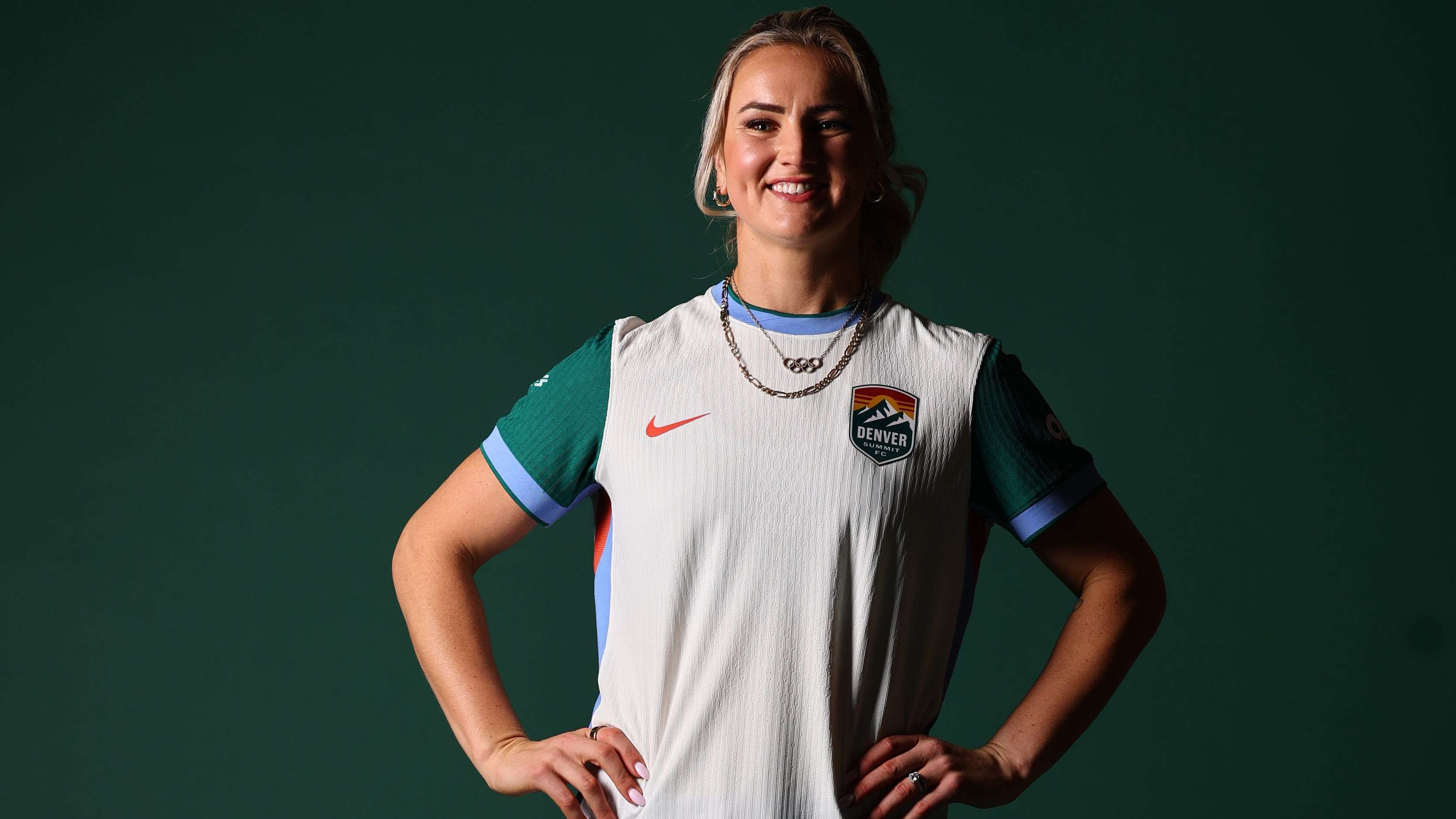
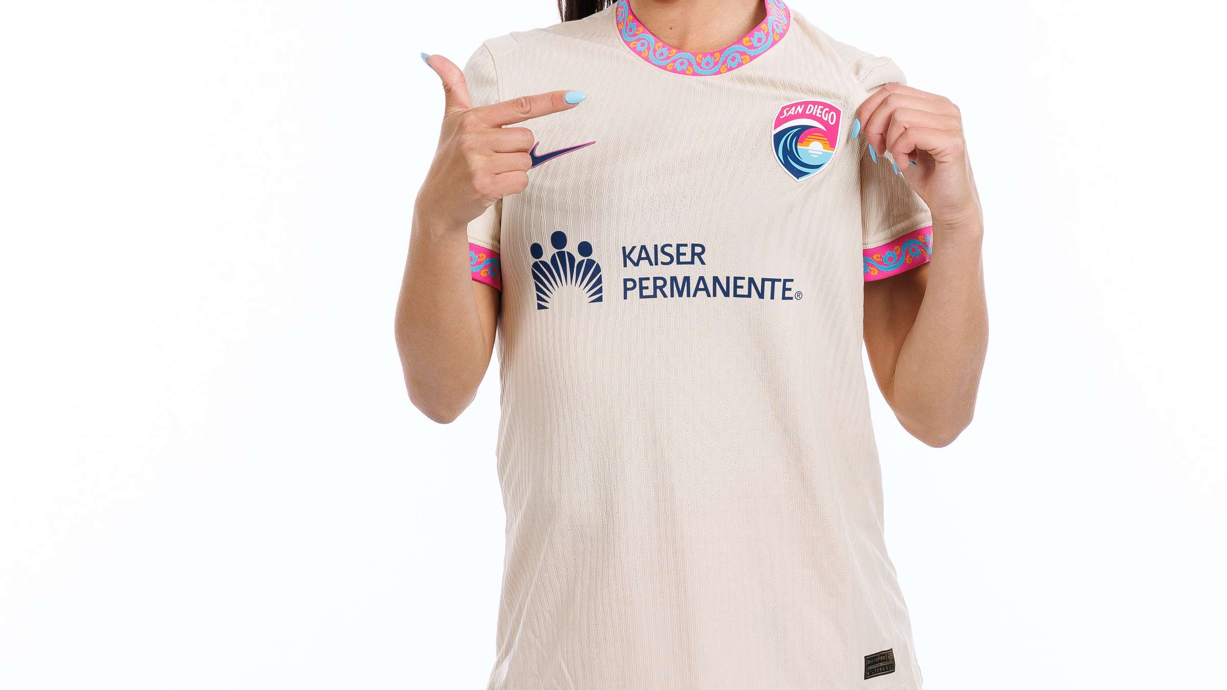
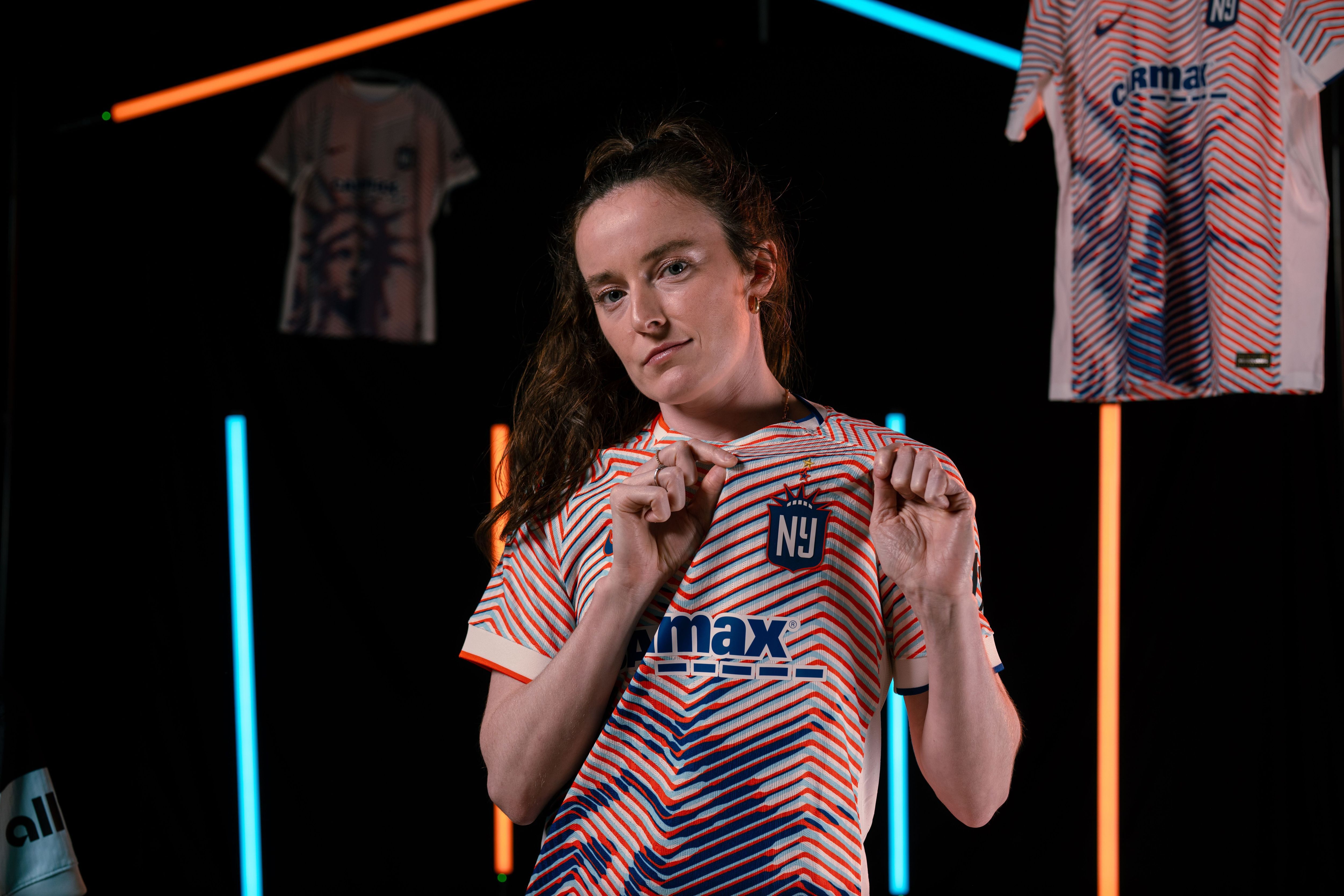
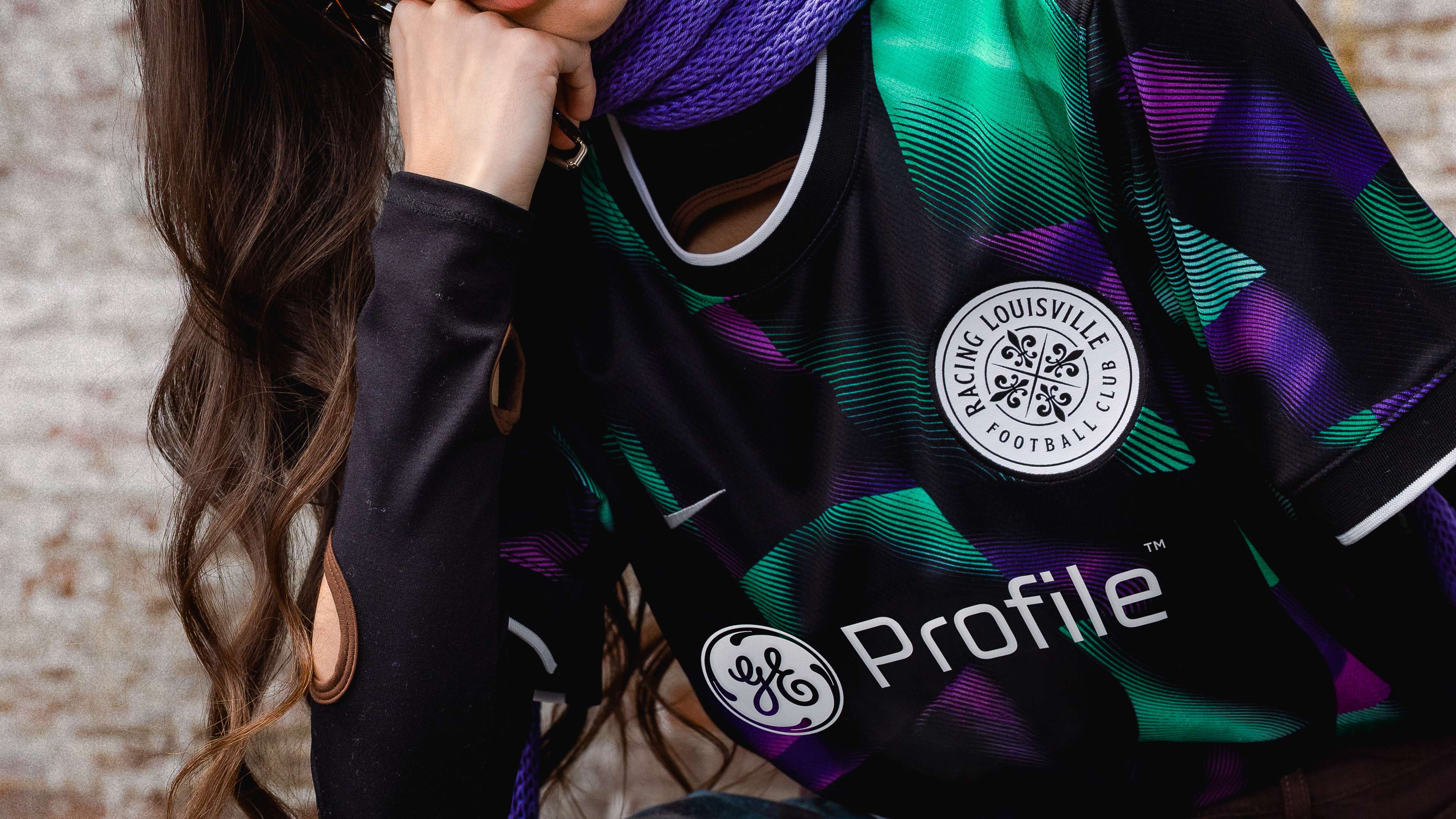
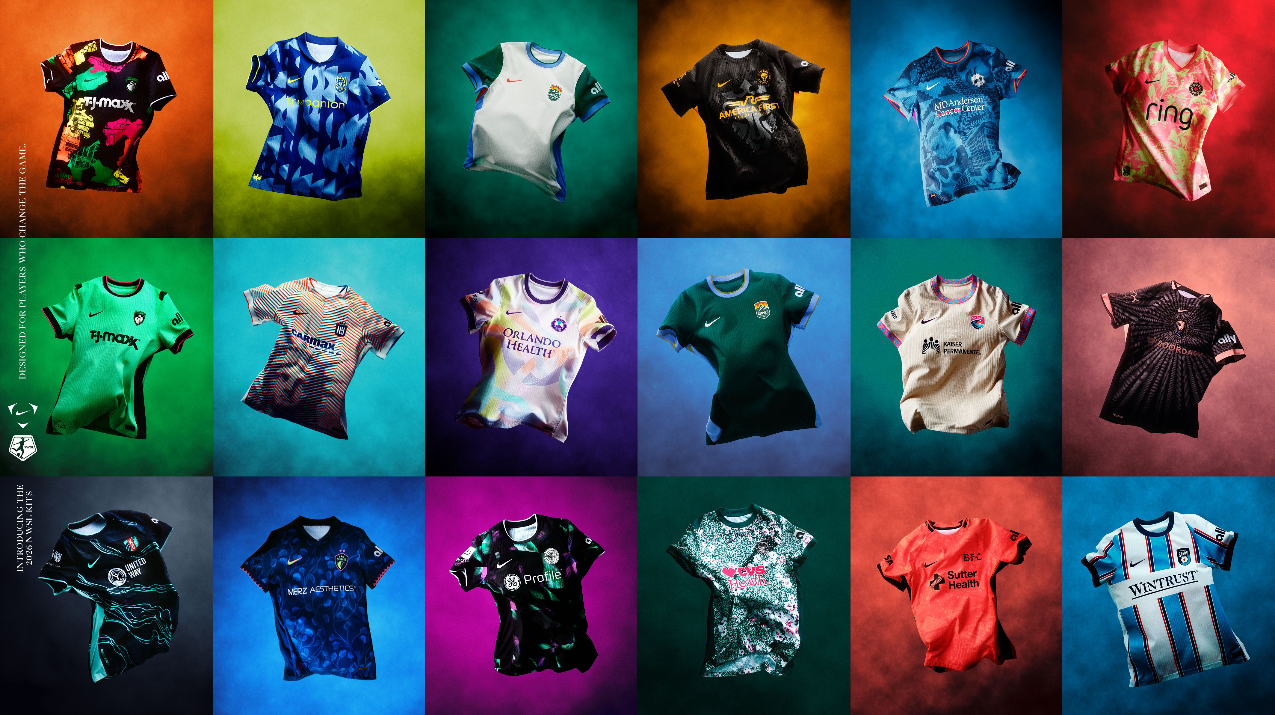
Not long ago, it felt like NWSL clubs were playing things a little safe with jerseys. Clean lines, predictable templates, and common color palettes. While the jerseys were functional, they weren't always memorable. Now, enter 2026, and it's a completely different story. It's closer to an art project than anything else, and also nostalgia. Heritage crests are being reworked, and throwback color palettes are resurfacing. The designers aren’t afraid to mix colors, patterns, and symbols, which is refreshing.
Clubs are leaning into local culture, experimenting with trim details, and treating the shirt like a canvas instead of a uniform with basic team colors. It's a combination of modern energy mixed with retro looks, and a very obvious nod to history, identity, and cultural moments.
Much like every year, some of these kits will become instant classics, while others will age less gracefully. So in true fashion-meets-football style, GOAL writers - never shy when it comes to offering fashion opinions - are breaking down every single 2026 NWSL kit in another edition of… The Rondo.
.jpg?auto=webp&format=pjpg&width=3840&quality=60)
.jpg?auto=webp&format=pjpg&width=3840&quality=60)