
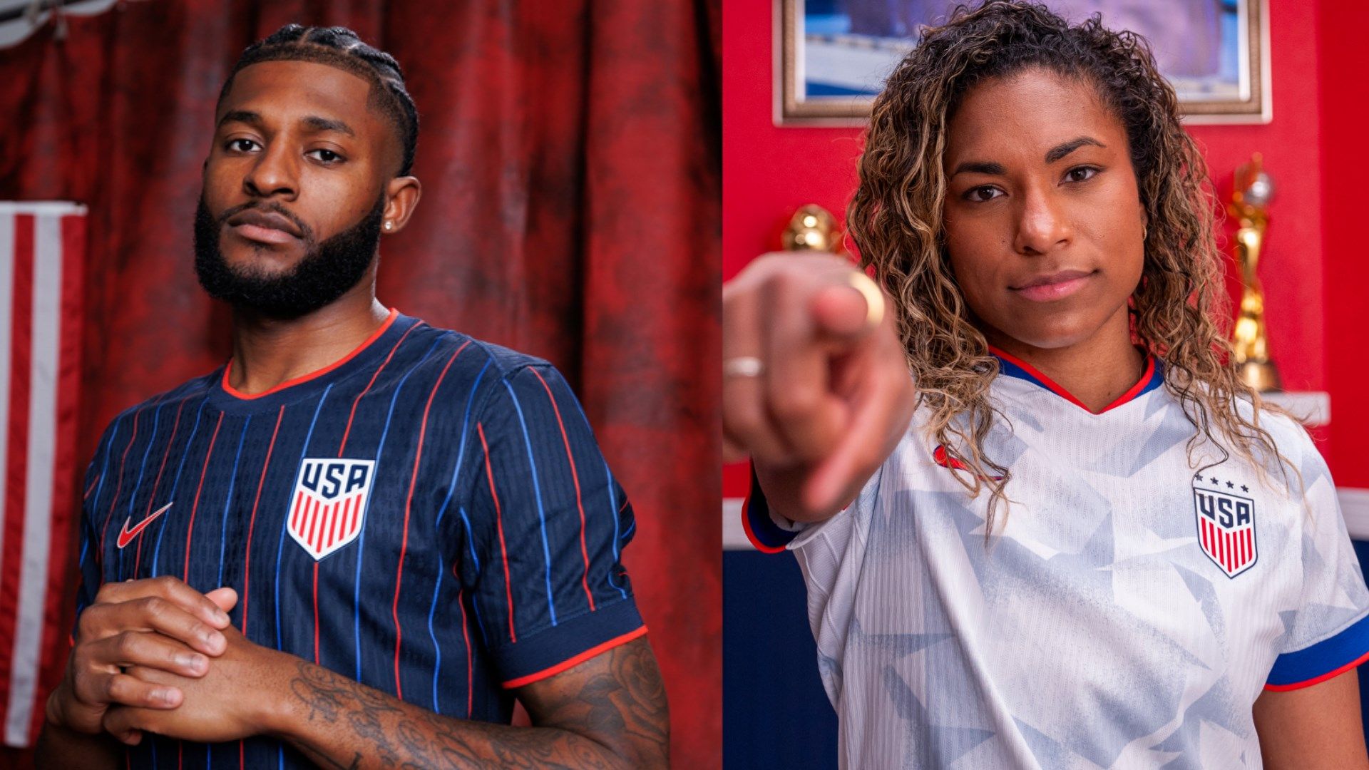
U.S. soccer dropped two kits this week. They're interesting. One plays it safe, a slight tweak on the generic red, white and blue that has defined the more recent generation of shirts. The other, though, is a bit bolder. Vertical stripes aren't really a thing in soccer these days, but Nike has brought them back on top of a dark shirt. It's different, admittedly fresh - and has brought about quite a bit of discourse in social media as a result.
The U.S. has an interesting history when it comes to kits. There are some classics: the 2014 away kit, the 2012 "Where's Waldo shirt" and the 1994 "denim" jerseys live long in the memory (for better or worse.) But equally, there have been a few duds, the design too often sticking to templates rather than going for something a little more bold and, well, American.
How do the new ones stack up? Are they future classics that will live long in the collective memory? Or is it a question of playing it safe, something ultimately inoffensive?
GOAL US and INDIVISA writers debate the new U.S. kits, and where they rank in the long line of national team shirts.
.jpg?auto=webp&format=pjpg&width=3840&quality=60)


