USL Kit ranks GFXGOAL

USL Championship kit ratings: Big swings, big hits - and some big misses - ahead of the 2025 season, with Sacramento Republic and Tampa Bay Rowdies leading the way

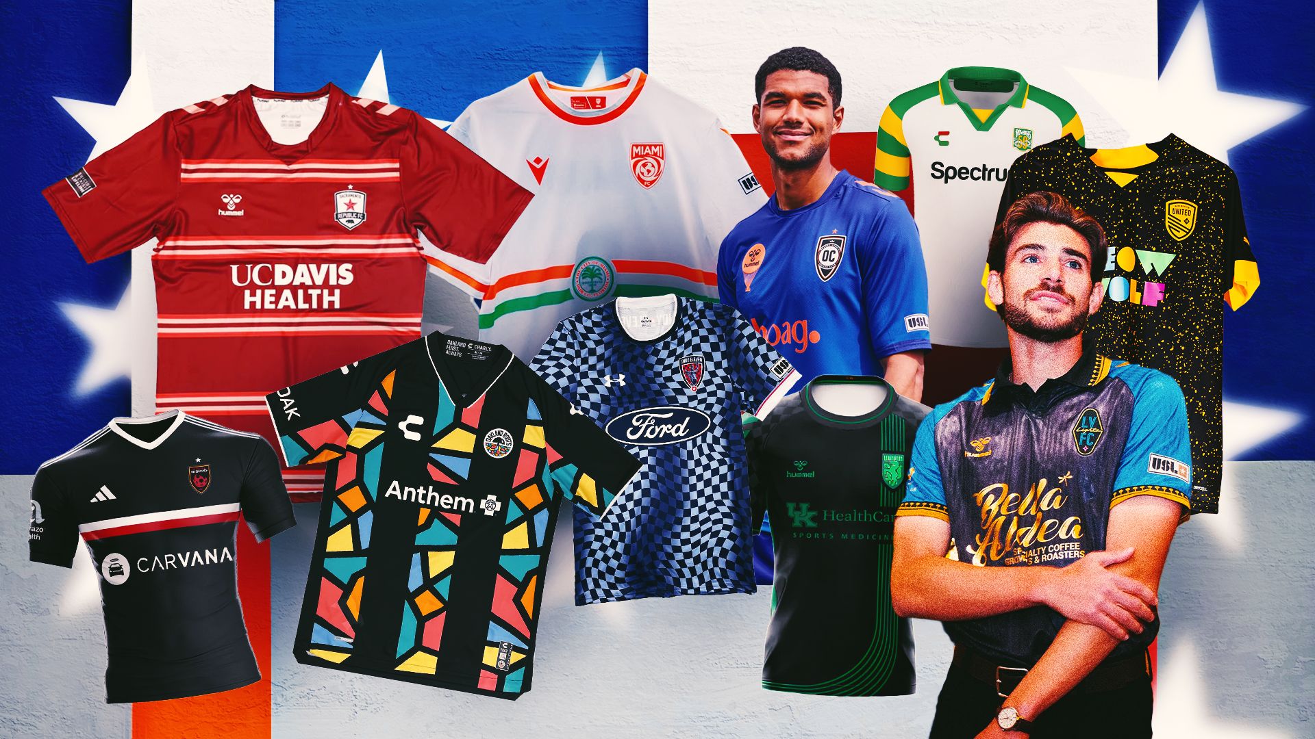
USL Championship season means it's officially kit season. And, as per usual, there's plenty of scope for debate here. Most of the league's 24 teams have released at least one new jersey. And with the campaign already underway, there will undoubtedly be more to come.

It's an interesting year for any number of clubs, too. Lexington Sporting Club have acknowledged their move to the USL Championship with a new kit.Tampa Bay Rowdies are celebrating their 50-year anniversary in style. Meanwhile, Sacramento Republic, Miami FC and others have all celebrated landmark seasons with new and updated looks.

This is all subjective, of course, but that's the fun of it. With that, GOAL rates the hits and misses as the USL Championship season gets underway.

  • HIT: Sacramento Republic home

    Yes, yes, yes, yes please. Technically, Portland Hearts of Pine kicked the whole lateral stripes thing off. But the Republic put their own spin on it, with contrasting colors. A word for this looking equally cool on the pitch, too.

  • Advertisement
  • MISS: Phoenix Rising home

    Rising have traditional been very, very, very good with their home kits. This one, a pretty bland red that looks like a sort-of rip off a Chicago Fire jersey, misses the mark. Not a bad one, just a little underwhelming.

  • HIT: Miami FC home

    The FC Miami home jersey is intended to pay tribute to the city itself. The jersey was released on March 5 - a reference to the "305" area code. The seal of the city adorns the front, while the back is plastered in a pattern spelling out "1896." Wonderful stuff from the "other" Miami team.

  • MISS: Sporting Lexington home

    Black kits really should work. But if you're going to go for the all-black look, you've got to fiully committ to the bit. The accents here take away from what should be a beauty. Lexington haven't done a bad job here, but there's a nagging feeling that it could just be a little bit better.

  • HIT: Tampa Bay Rowdies away

    What a way to mark 50 years of existence. Many teams would have shied away from nostalgia. After all, a lot of soccer merch is going that way - especially with an affinity for the early 2000s (shoutout to the Adidas Predator's glorious return). But why not just full send the '70s design? It's what the Rowdies have gone for. And it works a charm.

  • MISS: Indy Eleven home

    Indianapolis fans may have a different perspective. After all, there's clearly a reference to the checkered flag of the Indy 500 going on here. But from a broader view, it doesn't quite work.

  • HIT: Las Vegas Lights home

    It wouldn't be right for Las Vegas to have a subdued kit. The whole city is about glitz, in-your-face maximalism. Why hide from that when you can make something truly beautiful by going all in? They've done it, and the result is truly gorgeous.

  • MISS: Orange County home

    Throwbacks exist on a knife edge. They're either beautiful examples of nostalgia-bait, or near misses with good intent. This one is the latter, with a nice color, but not much else brought to the equation.

  • HIT: Oakland Roots home

    This kit has technically been around since last year, but it was so good that the Roots stuck with it. And fair play to them for doing just that. There are things happening here, all jagged angles and fun colors. It looked good last year, and looks even better now.

  • MISS: New Mexico United home

    This one divides opinion. It's a minor update on last year's, which was a bit of an internet sensation for its unique design. Where most might have toned it down, New Mexico gave it more "oomph" with the "Meow Wolf" updated, upgraded, and with more in-your-face imagery. It was already a lot. This makes it too much.