
Are you 24 or older?

Help us verify your age by providing an honest response. This site contains gambling advertising for 24+.

Age-restricted content

You’re not old enough to view betting content. You’ll be redirected to the homepage.

This page contains affiliate links. When you purchase through the links provided, we may earn a commission.
MLS kit rondo GFXGOAL

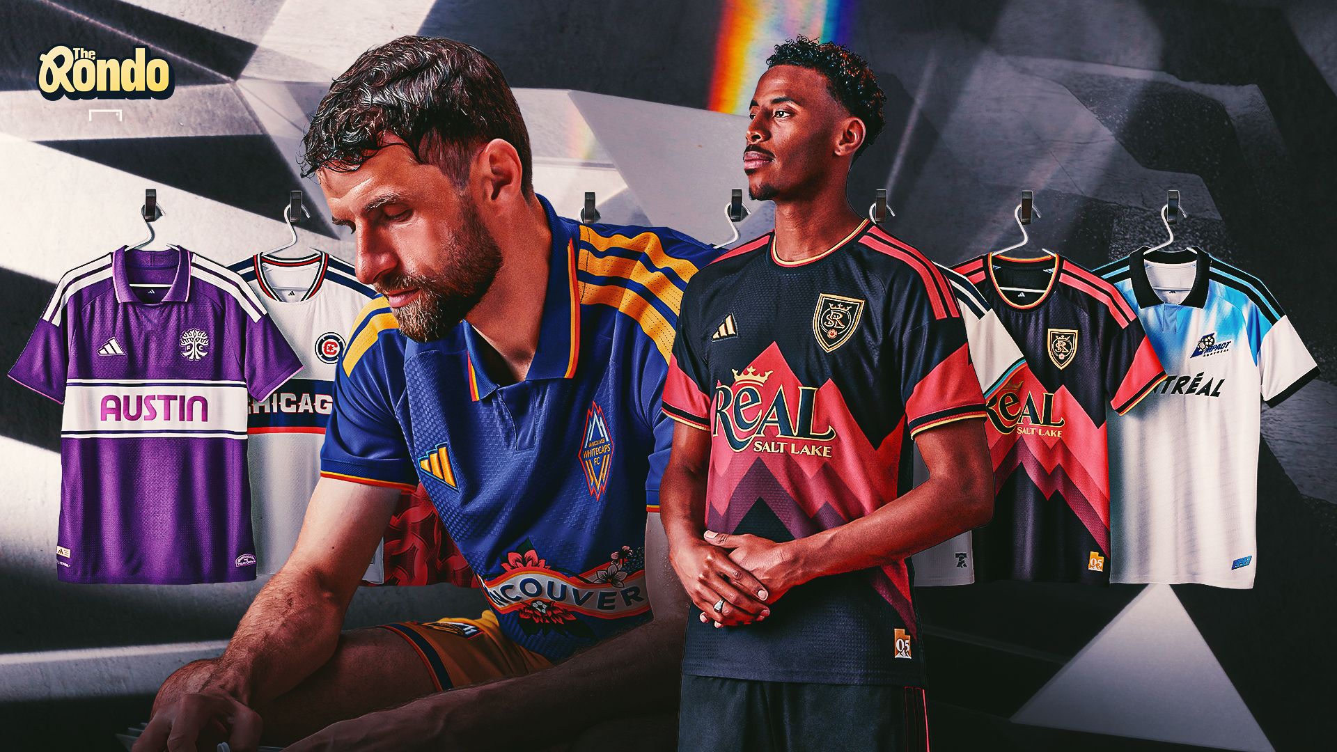
The Rondo, MLS Archive Collection edition: Is RSL’s kit a new classic? Did Chicago Fire get it wrong? Are the league's kits getting stale?

Let's play the fashion game. MLS has, in recent years, done a fine job of providing third kits that offer something a little different. Home and away jerseys feel a bit too formulaic - if only due to the fact that Adidas does the kit creation for the entire league. Well, third kits change things up.

And this year's throwback collection is certainly worth discussing. Eight different teams have been given their first throwback offering. Some of them, such as Austin FC, are new franchises going for a fresh(er) look. Others, such as Montreal or Vancouver, have gone deep into their pre-MLS roots.

The results are admittedly mixed. There are some kits here that will live on in the memory. Others, perhaps not so much. GOAL writers debate the good, the bad and the ugly in a kit edition of... The Rondo.


  • Philadelphia UnionGetty

    Which is the best of MLS’s latest kit drop?

    Tom Hindle: Actually really dig the Philly one. There can be a tendency to overdo these things, or nostalgia-bait a little bit too much. The snake crest, though, is fantastic, and the front-of-chest logo hits the right mark between dorky and charming. Nicely done to the City of Brotherly love.

    Ryan Tolmich: Real Salt Lake. The design feels super 90s, and it very clearly connects with the club's city. When a kit both makes sense and looks cool, you've done something right.

    Alex Labidou: The Archive Collection is largely fresh, although producing a throwback kit for Austin FC - a club that only began play in 2021 - feels slightly farcical. The standout has to be Real Salt Lake. The oversized “REAL” gives it a proper retro feel, while the overall design works just as well off the pitch. Vancouver is a very close second.

  • Advertisement
  • Chicago FireGetty

    Which is the worst of MLS's new kit drop?

    TH: Austin, BY FAR. Their whole thing is being green. Why the heck would you release a violet kit? The press materials suggest that it alludes to the color palette of the "iconic sunsets" that fall over the city. Sure, but this is just the wrong color.

    RT: Chicago, largely because I didn't even realize it was a different kit than ones we've seen recently. It essentially is a normal kit with "CHICAGO" instead of a sponsor. Is that supposed to get me excited?

    AL: Adidas, MLS: Please throw out Chicago Fire’s kit immediately. It looks like a knockoff of Vancouver’s standard MLS jersey, which defeats the purpose of a special-edition release. Houston’s is close behind; like many of its recent kit drops, it is very blah.

  • Vancouver WhitecapsGetty

    Are any of these among MLS’s greats?

    TH: Not really. Even though they're not the *best* kits, RSL's and Montreal might have a little more staying power, mostly because they check the retro box. You can imagine some social media account in five-plus years' time tweeting something to the effect of: "Remember MONTREAL'S SICK third kit from 2026 *fire emoji*." Otherwise, there's a whole lotta meh here.

    RT: Maybe RSL and Montreal, but otherwise, these are mostly too vanilla to be anything close to a classic. Some of these are hardly wearable, let alone all-time greats.

    AL: RSL and Vancouver deserve to be in the conversation. The rest are mostly solid, but none feels especially memorable.

  • ENJOYED THIS STORY?

    Add GOAL.com as a preferred source on Google to see more of our reporting

    Add as preferred source on Google
  • Julian Hall New York Red BullsGetty

    Which team most needs a throwback jersey?

    TH: D.C. United, BY FAR. They had a crack last year, but it didn't really strike a chord. They won the first MLS Cup, and deserve something proper that will acknowledge that. A word, too, for NYCFC, who have officially been around long enough to earn some recognition. Throw a pigeon on it or something, I don't know.

    RT: All of the OGs. Give me more 90s chaos and, if your team wasn't around then, make a shirt that looks like it was. Stop with the corporate slop and give me more color, creativity and fun.

    AL: Assuming the Archive Collection continues annually, most clubs should eventually get their turn. Surprisingly, Red Bull New York remains without one. The franchise traces its history to the MetroStars and MLS’s inaugural 1996 season, so there is plenty of genuine heritage to explore.

  • Lionel Messi - Inter Miami 2026Getty

    Are MLS’s kits getting a bit stale?

    TH: YES! Nostalgia-bait has reigned supreme for the last couple of years, and probably hit its peak with Adidas's sublime World Cup collection. Otherwise, the well is running dry, and new ideas have to come into the fray. Shoutout to USL clubs for taking real risks and thinking about their designs a little more. This writer was not a fan of it, but Brazil's World Cup kit - which was a bit out there - should also stand as proof that new can be better.

    RT: Kits everywhere are. Everyone wants to play it safe and explain the most basic of details with a graphic saying how this circle represents the city's momentum. Stop it. Take some swings, miss a few times, but make some classics along the way. Wouldn't that be just a little bit more fun?

    AL: Not across the board, but some of the special-edition drops are becoming formulaic. MLS does not necessarily need to move away from Adidas, but it should bring local artists and outside designers into the creative process more often. Several USL clubs are crushing it with distinctive, risk-taking designs, while some MLS kits can feel a bit bland at times.