MLS Kit TiersGOAL

MLS 2026 kits tier list: From St. Louis City SC's iconic Tina Turner kit to Nashville SC's interesting badge placements

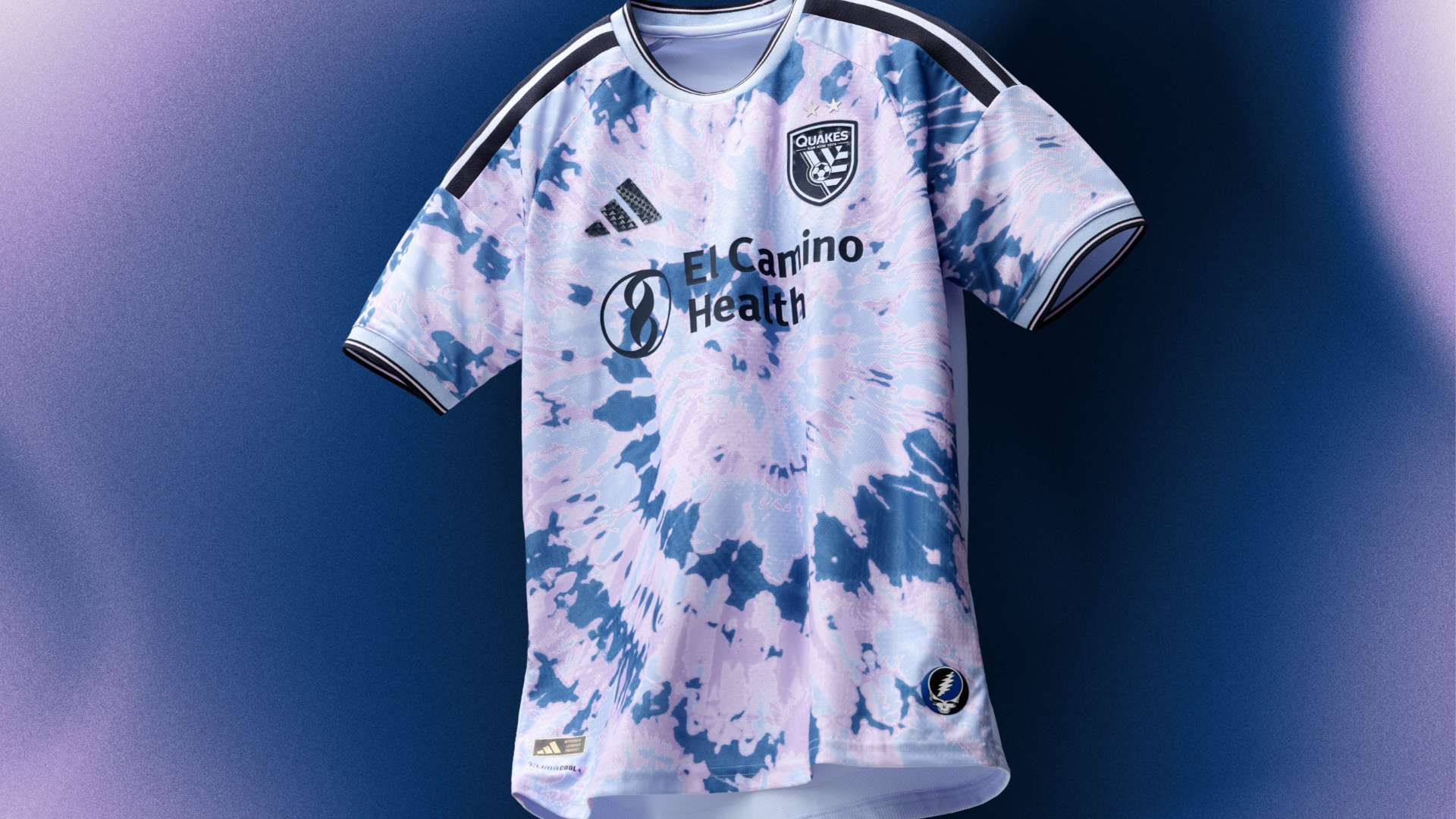
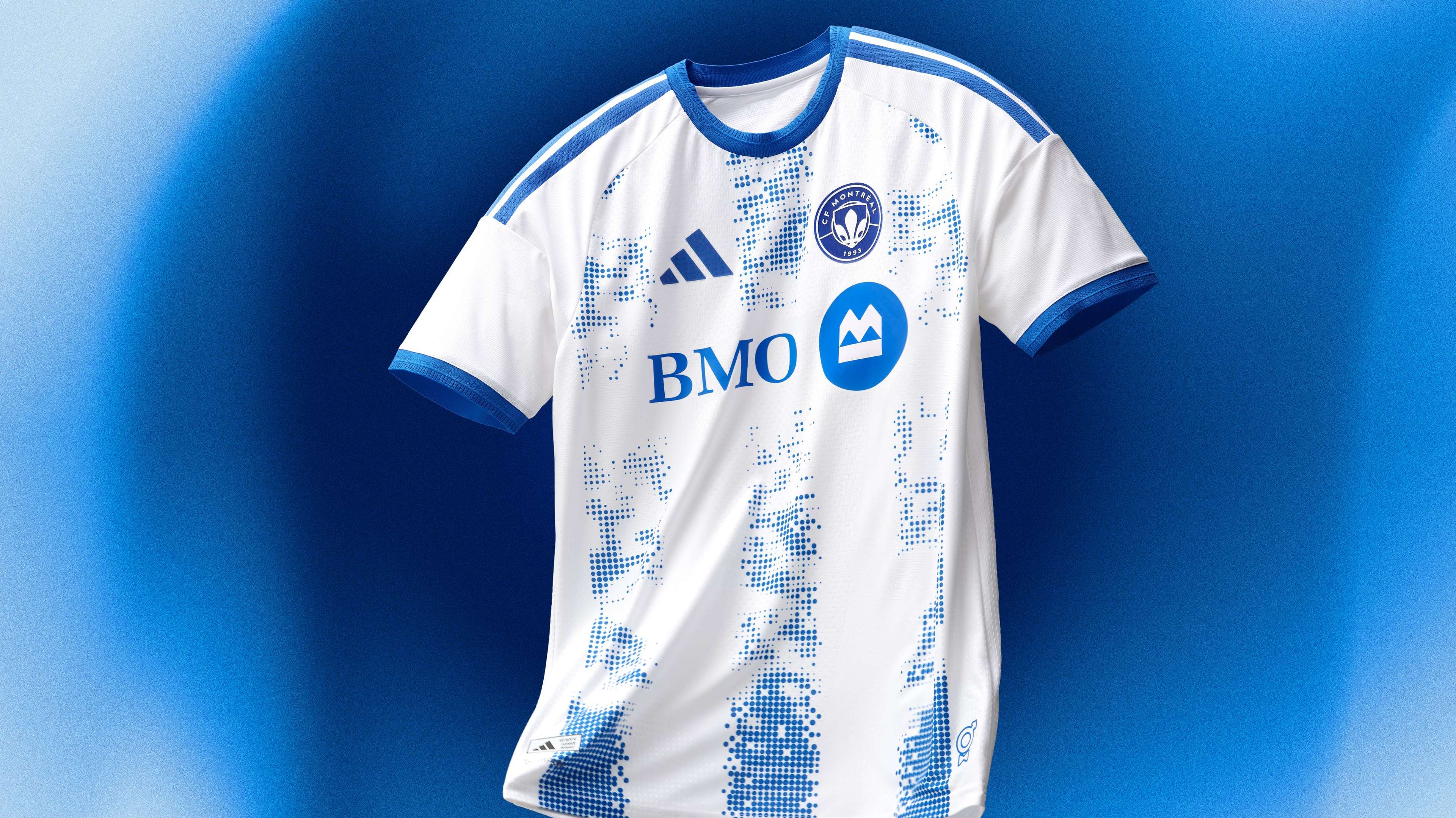
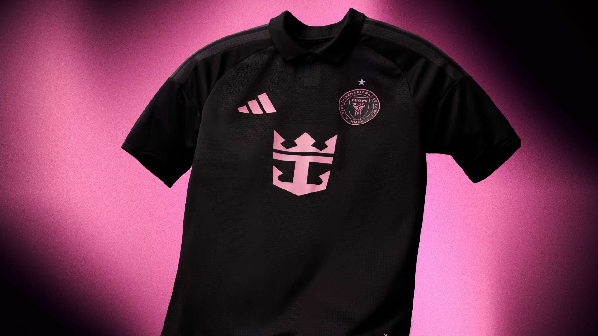
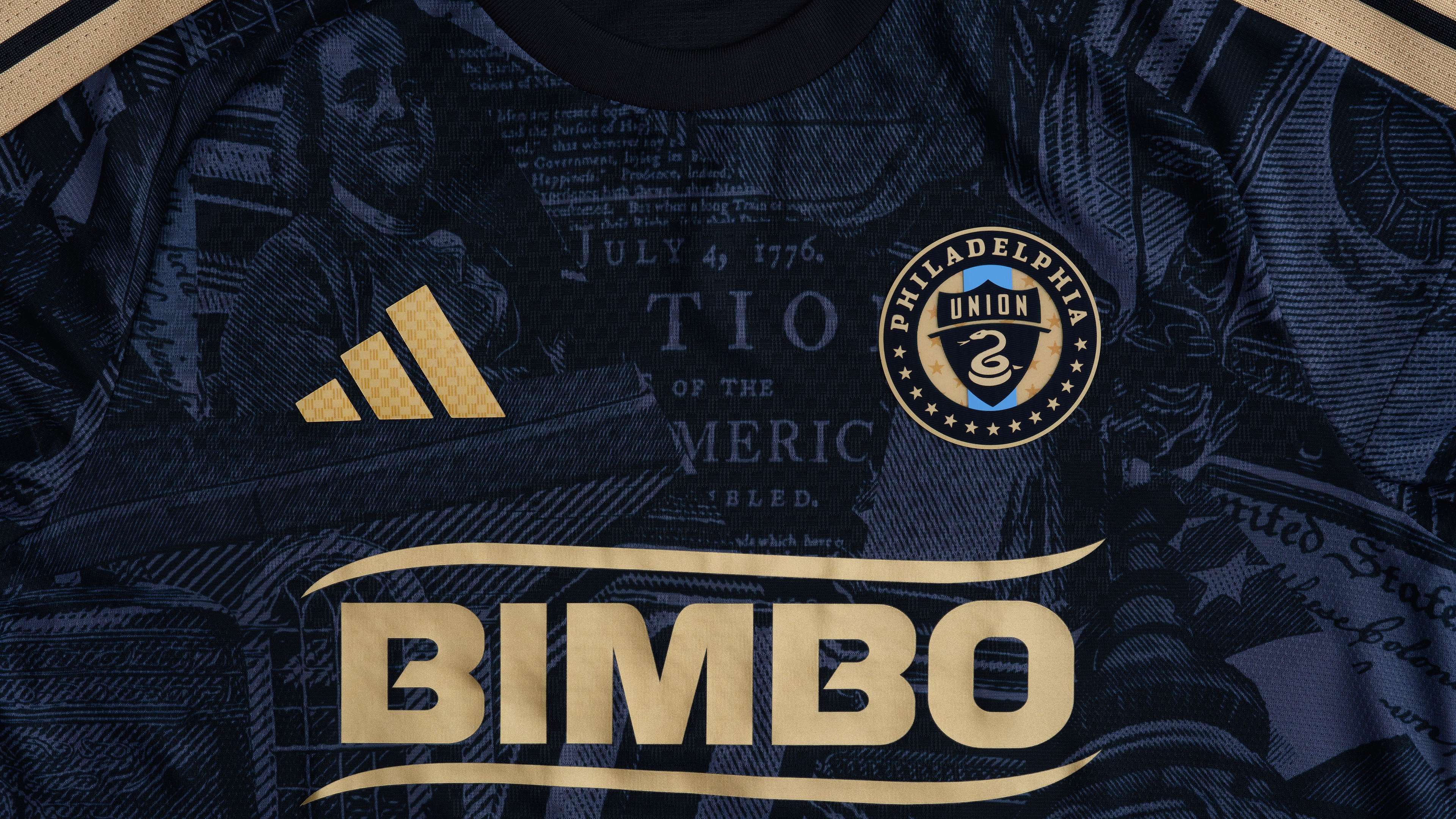
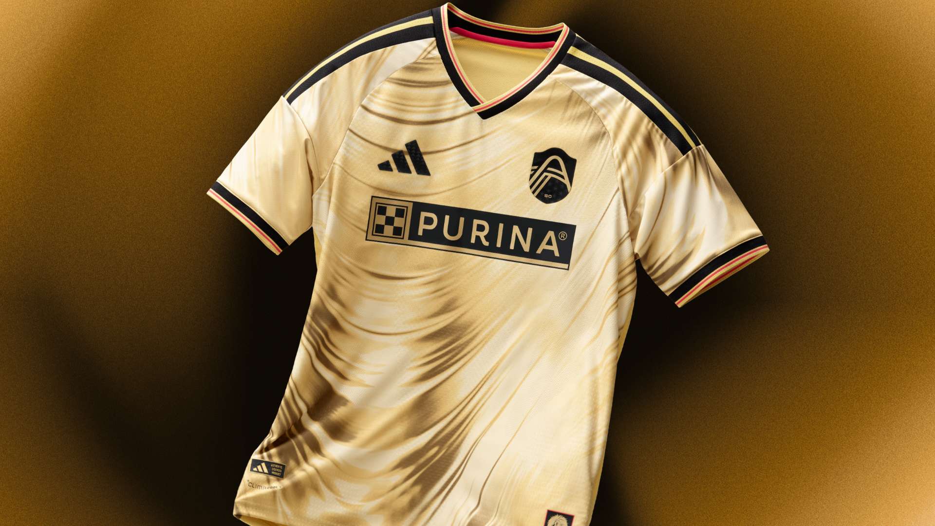
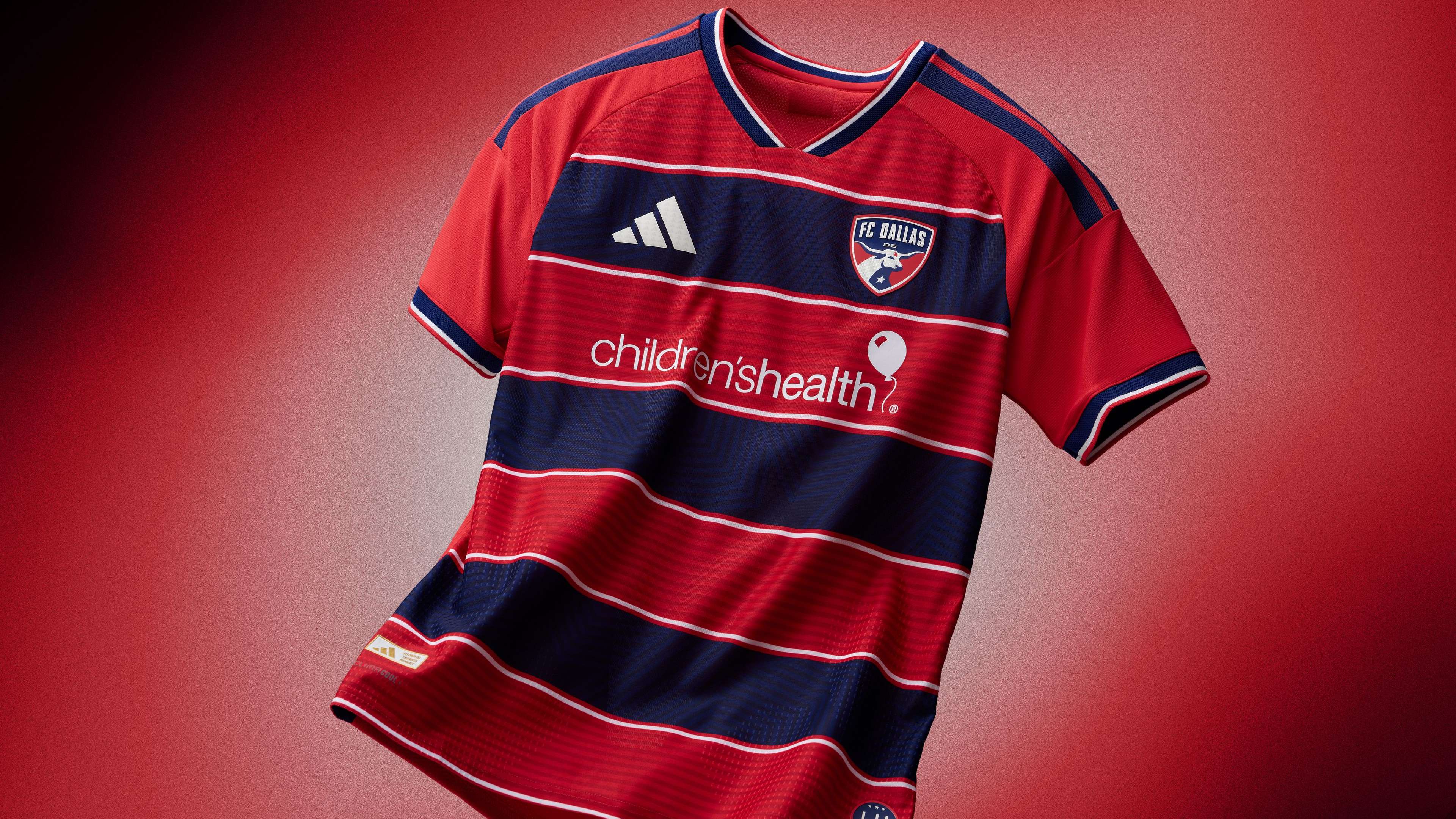
Despite all of the debate that comes from the action on the field, nothing riles up fans of MLS quite like kit release day. It's on days like today that everyone feels like a fashionista and everyone feels like they have some thoughts on which teams got it right and which teams got it very, very wrong.

Kit releases are always a bit of fun. They're often also up for debate. Not every shirt is for everyone, and that's okay. Some are, though, and some are quite clearly only for the 11 players that will be wearing them on the pitch. To MLS' credit, teams have tended to be more willing to take risks than some of their counterparts around the world, and those risks sometimes land spectacularly and sometimes land... not so spectacularly.

At GOAL, we're here to break down the latest crop of MLS kits released ahead of the 2026 season, offering up our thoughts on which teams nailed it and which need to go back to the drawing board ahead of next year.

  • San Jose kit 2026 Major League Soccer

    I will wear pretty much anything else

    Nashville SC - Discombobulated, is the word. Why is the Adidas logo bigger than the club badge? What is the spacing? Are those squiggly lines doing anything? Just a BIG disappointment. 

    San Diego FC - Kits supposedly tell stories. What thrilling narrative has San Diego tried to convey here?

    San Jose Earthquakes - There is nothing wrong with paying homage to the Grateful Dead. It's actually quite cool, in theory. But there is NEVER an excuse for a tie-dye jersey. 

  • Advertisement
  • CF MontrealCF Montreal

    Missed the mark

    CF Montreal - Great message with their work for prostate cancer, but the kit itself doesn't land. The good news is that their home kit remains elite tier.

    Orlando City - It looks like a goalkeeper kit. A nice goalkeeper kit, it has to be said, but still.

    FC Cincinnati - Cool idea with stripes and, sure, there are reasons to make them all wiggly, but it doesn't quite hit.

  • Inter Miami kit 2026Major League Soccer

    PLEASE try something new

    Columbus Crew - Sure? It's eerily similar to a fair few of their kits over the years. Throwing a collar on things and calling it a day doesn't work. 

    Charlotte FC- Have Charlotte kits ever been fully cool? Yes, the trim works on the sleeves and neckline, but they could do with taking a risk. 

    Colorado Rapids - The Rapids kits have been alright for a few years. That's cool, but there's potential for them to be next level. 

    Inter Miami - Well, it's black, and the trim is a different color. Seen this before?

    D.C. United - The OG MLS franchises have literally no excuse for not doing something fun. 

    Vancouver Whitecaps - Surely you should celebrate the inevitable sales that come from Thomas Muller's signing by taking a risk? Changing the trim is just a bit lazy. 

    Seattle Sounders - Seattle, you made an actual Orca kit in the past. Dream big. 

  • ENJOYED THIS STORY?

    Add GOAL.com as a preferred source on Google to see more of our reporting

  • Union kitPhiladelphia Union

    We like where it's going

    Philadelphia Union - Oh, this is very Philly. You've got some landmarks and Americana in there, which makes sense with it being the big ole' 250th birthday. It does limit who wears it, though, even if those who are fans of the team should eat this up.

    New England Revolution - Similar-ish vibes to the Red Bulls kit, but not quite as cool. The firework stuff is very nice, though.

    Toronto FC - Very clean, so credit to them for that. Could have been a little bolder, but overall, it's a classy one.

    Houston Dynamo - The space vibe is a great idea, but it could be a little bit more old school to really nail it.

    LA Galaxy - The sash is great, but can we change it up just a little bit to make it sparkle?

    Minnesota United - It feels very in line with what the club does, but what do we have to do to get the big loon back?

    Chicago Fire - It's close to being in a tier above, but it just isn't quite creative enough. It does pop, though.

  • St. Louis City kit 2026Major League Soccer

    Got that thing on, for real

    Real Salt Lake - The patchwork ones last year were quality, and these are of the same ilk. The horizontal stripes are delightful, while the trim gives it a little pop. The only thing hurting the kit? The sponsor, which could be a little cleaner. 

    Sporting KC - They've gone with a semi-tartan diamond thing, and somehow it works. Some risks pay off, and this is one of them.

    St. Louis CITY - Gold and dedicated to Tina Turner? Yes please. The only complaint: will it look good on the pitch?

    Austin - After a couple of bright choices, Austin have stripped things back this year. It's a welcome switch, and the badge is clean. Not so sure about the thick lining on the shoulders, which doesn't quite work. 

    NYCFC - Go on then, NYCFC! It's a bit out there, but they've done well here. Issue is: what the hell are those circles? Apparently, it's inspired by the NYC flag and the Unisphere, which seems cool but doesn't fully work. 

    Portland Timbers - Very, very Portland in the best way. The kit feels both historic and modern, which is a tough balance to strike.

  • FC Dallas kitFC Dallas

    Will never take it off

    FC Dallas - Here at GOAL USA, we love good hoops. FC Dallas did their hoops just about perfectly, leading to a shirt that will look both classy on the field and off of it, if you're into that sort of thing.

    LAFC  - They rarely miss, and they sure didn't this year. It's a kit that feels both unique and quintessential LAFC, which is the goal of this whole process, isn't it? Any time you can stick to your club identity and make something that feels different, you killed it.

    New York Red Bulls - This one's fun! It felt the Red Bull ethos of being a little wild and crazy, but it's also a shirt that you can get away with wearing in day-to-day life. The right mix of loud and creative to make a standout shirt.

0