What’s in a jersey?
The best are ones that you can look at and instantly know what team is wearing it. Icons of the game, such as the New York Yankees pinstripes. Or retro versions that hone in on a team’s location and what makes it special, such as the Arizona Coyotes’ jerseys.
Soccer national team jerseys can be more difficult. How do you encapsulate a nation?
 Getty Images
Earlier this month, Nike released a special edition of the beloved 1999 U.S. women’s national team kits.
.jpg?format=pjpg&quality=60&auto=webp&width=380) Getty Images
Getty ImagesIt’s a crisp white jersey, with red and blue piping on the edges of the sleeves and neckline. And the old US Soccer crest offsets the Nike logo, with player numbers in the center. Iconic for many reasons. And perhaps most for the names that used to wear it - players such as Kristine Lilly, Mia Hamm, Brandi Chastain, and more, who inspired the current generation into becoming who they are today.
But is it the best iteration of the USWNT jersey? At this point in the team’s history, there have been many. Some have hit the mark, others have not. What goes into determining the best jersey in USWNT history?
One measure is jersey sales.
Despite acquisition issues, the team’s 2019 home jersey was the top-selling soccer jersey in the world, men’s or women’s. It also marked the team's fourth World Cup win, and possibly the best USWNT roster to hit the field.
Or maybe it’s the jersey's polarity.
Love them or hate them, nobody can deny that the team’s 2012 “Where is Waldo” uniform isn’t one of the most well known in its history.
World Cup jerseys seem to take on a special meaning, particularly when considering that a team has won four World Cups while wearing them. When considering that, there’s something to be said for the U.S. team’s first World Cup jersey in 1991, back when adidas was the manufacturer of the team’s jerseys. Stylization of the flag’s colors diagonally on one sleeve and making its way to the opposing side of the shorts took advantage of looser and baggier jerseys that were true to the ‘90s.
 Getty Images
But there’s also a lot going on, and a lot to be desired with the kit. It was in 1995 that a true all-white kit was introduced, as the team switched to Nike – who has manufactured every USWNT kit since. The team’s away kits have been a mix of red and blue, with the oddities being 2007 (a gold kit) and 2011 (a black kit). To make note, the 2011 kits might have one of the better collar designs ever created by Nike.
Those were then followed up in 2014 by an actual collar, and the team wearing what looked like a polo shirt on the field. All that can really be said about the kit is what Alex Morgan said about it in the team release.
“The cut of the women’s kit fits well and is comfortable,” Morgan said. “I don’t have to think about the uniform and can focus on the game at hand.”
That it followed up a somewhat surprisingly fun centennial retro jersey with a rekindled crest to celebrate 100 years as a soccer federation was disappointing.
When looking at the kit package as a whole, 2019 might be one of the best. A classic white home jersey that wasn’t too boring packaged with a red away kit that featured an abstract stars and stripes design. It was simple, but effective.
The team’s kits in 2022 were clearly created with the men’s team in mind, as the front grew busy with the crest, World Cup winners patch and jersey number all thrown together like a hodge-podge, since the USMNT hasn’t actually won a World Cup.
There was a marked improvement in 2023, as the numbers were then removed and the crest, World Cup patch and Nike logo all formed a straight line across the chest. At the end of the day, jerseys are in the eye of the beholder. Many have grown to enjoy the team’s 2023 kits, particularly the home kit that draws inspiration from the abstract expressionism movement in the art world with paint droplets similar to that in Jason Pollock’s work.
According to Nike, it was a key component to include as the movement, “started in the 1940s in New York and shifted the art epicenter from Europe to the U.S., similar to what the USA team has done for women's soccer.”
Perhaps the best part of the 2023 kits is that each player held a unique paint splatter pattern. While the team displayed unity on the field, their jerseys were able to signify the unique abilities that they each brought to the team. Together, they formed their own type of painting.
 Getty
GettyBonus points for blue shorts, because it was about time that we started recognizing that women do, in fact, have periods. The away kit wasn’t a knock either - although the pattern did at times make for a headache-inducing watch on the TV, particularly during the early morning wakeup times while the team was in Australia.
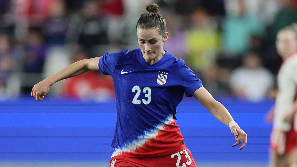
When it comes to this year’s kits, the home kit's shining trait is the neckline, which evokes the look of an American flag with blue turning into red and white stripes. The away kit has its moments, and maybe the fact that it invokes memories of childhood barbecues featuring everyone’s favorite frosty cold treat – the Bomb Pop – is a good thing.
 USA Today Images
What’s fun when looking at the jerseys through the years is watching how they’ve evolved as both technology and fashion has evolved – as well as the game itself.

