The 2022 MLS season is reaching its final stages, with Los Angeles FC currently sitting on top of the table with seven regular season games to go. To mark the business end of the tournament, we’ve compiled the best home kit from every MLS season so far, beginning with the loud and the garish 26 years ago, and continuing to today’s more sophisticated designs.
 Getty Images
These are the 26 best MLS home jerseys of all-time
 Getty Images
1996 - New England Revolution
The MLS was a different beast in its inaugural season than it is today, and nowhere is that more exemplified than in some of the absolutely wild kits. New England Revolution is the pick of the bunch, with a huge graphic at the top of the shirt, somehow emanating from the Reebok logo. The shirt also dispenses with a host of traditional features: the sponsor is replaced with the word “Revolution” in a blood red scrawl, while the club crest appears halfway down the shirt. From the get-go, the MLS was doing things differently.
 Getty Images
1997 - Kansas City Wizards
By its second season, some MLS teams were still determined to push the boat as far as they could. Sporting Kansas City — or the Kansas City Wizards as they were known then — adopted a wavy rainbow pattern across the top half of their shirt. The MLS still eschewed sponsors at this time as well, with the team’s Kansas City home printed in the middle of the shirt instead.
 Getty Images
1998 - MetroStars
Back in 1998, the idea of the New York Red Bulls was still a long way away. Back then, they were known simply as MetroStars and their sponsor's logo was nowhere near their shirt. Instead, they wore a red shirt adorned with yellow and black stripes. The kit was finished with a black and white collar, and it's impossible to imagine it being worn by anything other than a 1990s MLS team.
 Getty Images
1999 - Colorado Rapids
There are a number of different details that make Colorado Rapids’ 1999 home kit an underrated classic. Firstly there’s the white and green colourway — complete with a wave-like green pattern — then there’s the Colorado Rapids logo. Once again sitting where you’d perhaps expect to find the sponsor’s logo, the team's name comes in bright yellow and is finished with a crashing blue wave graphic.
 Getty Images
2000 - Miami Fusion
Miami Fusion were a short-lived MLS experiment, who sadly petered out in 2002. In their penultimate season, the Fusion turned heads in a kit that could have easily been a golden era Parma design. The blue base, the yellow shoulders, the black collar, it all just worked perfectly. Add to that the club’s logo in the centre of the chest and there’s a forgotten MLS classic in there.
 Getty Images
2001 - Tampa Bay Mutiny
Another short-lived club, Tampa Bay Mutiny is perhaps best known for being home to Carlos Valderrama for 104 games. The club’s final ever home kit was by no means a classic, but it earns a place on this list through the font used for the club’s name. Arriving in the early aughts, it could’ve been a nod to Y2K or maybe it was a tribute to The Matrix. Who knows what they were thinking.
 Getty Images
2002 - Chicago Fire
The beauty of Chicago Fire’s 2002 home kit lies in the partnership with its away kit. The two designs are inversions of each other, with the home shirt’s red white and blue colour palette flipped for the away shirt. The key detail, though, is the absolutely massive team name in the middle, which inexplicably says “FIRE” on the home shirt and “CHICAGO” on the away.
 Getty Images
2003 - LA Galaxy
Nowadays, LA Galaxy may be most associated with wearing white, but that was all part of a rebrand to coincide with the arrival of you-know-who. Before that, they had generally worn a combination of gold, teal and black. The pinnacle of this colour palette came in 2003, when they combined a gold base with a teal and black diagonal stripe.
 Getty Images
2004 - FC Dallas
It’s easy to see the early years of the MLS as a litter of experiments in how football shirts could look different. Why should there be a sponsor? Why should the number only be on the back? FC Dallas, who were known as Dallas Burn back then, were one of the proponents of this and persevered with the unconventional squad number placement until the start of the 2005 season.
 Getty Images
2005 - Real Salt Lake
Everything about Real Salt Lake’s debut season in the MLS was inspired by Spain. The name was an obvious nod to some major Spanish clubs, while its design could’ve been the national kit. What elevates it from imitation to flattery, however, is the typography of the Real Salt Lake logo in the centre, complete with a regal crown above the e.
 Getty Images
2006 - Houston Dynamo
The white trim and the adidas template used on Houston Dynamo’s home kit immediately date the design to 2006 — maybe because the same design was used at that year’s World Cup, by Trinidad and Tobago no less. Houston Dynamo are able to take it to another level though, thanks to the use of a shade of orange the club describes as “Wildcatter.”
 Getty Images
2007 - LA Galaxy
In 2007 LA Galaxy launched a full rebrand, including the introduction of its new white, gold and blue colours. The reason for the decision was simple, the arrival of none other than David Beckham in the MLS. The first kit he wore for the club will always be the most famous, and it’ll always be remembered for the arrival of one of the most famous players in the world.
 Getty Images
2008 - Colorado Rapids
Colorado Rapids adopted their burgundy and blue colours in 2007 – replacing their blue and black stripes – thus aligning themselves with one of the most historic colour combinations in world football. Their first kit in those colours, which they wore into the 2008 season, was one of the best, with a classic collar and smart light blue trim. Admittedly, 2008 wasn’t a vintage year for kits in the MLS.
 Getty Images
2009 - Houston Dynamo
Houston’s famous “Wildcatter” orange took the crown in 2009, bolstered by the addition of grey detailing. As well as appearing on the sleeves, this new colour was also used to create a band that ran up from the armpit, round the neck and back again. It’s an unconventional addition to the kit, but it helped the Dynamos stand out as they reached the Western Conference Final.
 Getty Images
2010 - Philadelphia Union
Philadelphia Union entered the MLS in 2010 in a blaze of black and gold. The stand-out feature of the shirt was the thick gold stripe that ran down the centre, but one of the nicest features was a subtle blue trim, that echoed the colours of the newly-formed club’s crest.
 Getty Images
2011 - Portland Timbers
Another club that made an impact as soon as they entered the MLS was Portland Timbers, who wore a half-and-half kit for their first season. The split shirt was made even better by the subtly different shades of green used on each side and the bright yellow detailing. Then there’s the axe-wielding club crest as well.
 Getty Images
 2012 - LA Galaxy
Now happily ensconced in their white, blue and gold colours, LA Galaxy further improved the design in 2012. The blue took centre stage this time, with a diagonal sash covered with a geometric pattern. A subtle galaxy pattern was even used to adorn the inside of the neck.
 Getty Images
2013 - Toronto FC
Toronto were maybe a bit on the nose with the Canadian imagery for their 2013 shirt, which featured a huge red maple leaf. It worked, though. The design was completed by more dark red sections emanating from the central leaf and navy detailing across the stitching and around the neck and collar.
 Getty Images
2014 - Vancouver Whitecaps
Fellow Canadians Vancouver Whitecaps replaced their traditional horizontal stripes with a diagonal pattern. The stripes ran in a gradient pattern, transitioning from light blue to a darker shade and helping to complement the shirt’s white base in a nod to the different colours of the club crest.
 Getty Images
2015 - Orlando City
When Kaka arrived in the MLS, it was with the newly formed Orlando City. The club, making its debut in the MLS, was resplendent in a regal purple colour. The royal colour palette was continued through the use of gold detailing around the collar and on Orlando’s sun crest.
 Getty Images
2016 - Columbus Crew
In 2016, Columbus Crew swapped their classic colours. What was once yellow with a black trim became black with a yellow trim, and the kits have been all the better for it. The first kit with this new design also introduced an all-over tonal checkerboard pattern to the black base.
 Getty Images
2017 - Impact de Montreal
Impact de Montreal, or CF Montreal as they’re now known, managed to subtly improve their blue-on-blue stripes for the 2017 season. The club’s “Ice Grey” was used on two thinner stripes, while also adorning its French-inspired crest and other detailing across the shirt.
 Getty Images
2018 - Sporting Kansas City
In some ways, Sporting Kansas City, once known for their rainbow-print shirts, show how far the MLS has come since its carefree days in the mid-'90s. In 2018, the club released a much more grown-up design, with no rainbow in sight. Instead, it was a light blue shirt, with a sensible collar and some smart tonal stripes. All very nice.
 Getty Images
2019 - FC Cincinnati
FC Cincinnati have messed around with their orange and blue stripes throughout their history, but their first MLS kit was an innovative take on the design. The orange stripes were broken up on the front, with each one made up of diagonal lines of varying size and width to create an all-new take on the classic stripes.
 Getty Images
2020 - Colorado Rapids
Ever since they made the move to claret and blue, Colorado Rapids have been perfecting the design. 2020’s home kit almost entirely eschewed the light blue, using it only for the adidas Three-Stripes that appeared across the shoulder. This detailing even brought to mind Liverpool’s 1992 home kit, an all-time Premier League classic.
 Getty Images
2021 - Atlanta United
After years of perfectly-nice red and black vertical stripes, Atlanta United changed things up in 2021. The new shirt was mostly black, with just five thin red stripes running down the middle. As if this wasn’t good enough, Atlanta United completed the design with its classic metallic gold detailing.
 Getty Images
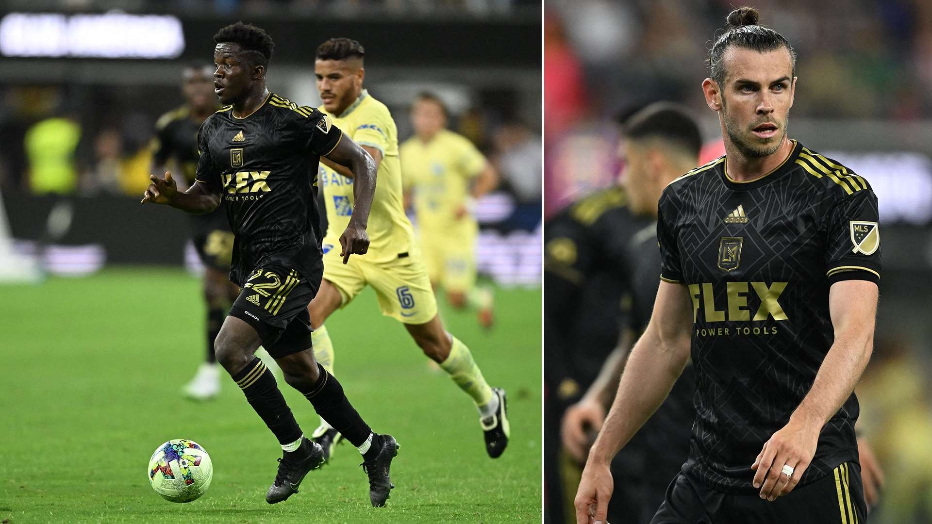
2022 - Los Angeles FC
Los Angeles FC – home to Gareth Bale and Giorgio Chiellini no less – have already landed a winner with this season’s home shirt. The club’s black and gold colours are still used, although an eye-catching Art Deco pattern has been added to the entirety of the shirt. All that to celebrate the club’s fifth anniversary.
ENJOYED THIS STORY?
Add GOAL.com as a preferred source on Google to see more of our reporting