+18 | Play Responsibly | T&C's Apply | Commercial Content | Publishing Principles
This page contains affiliate links. When you purchase through the links provided, we may earn a commission.
MLS 2023 home kits - ranked GOAL / various

New MLS 2023 kits: Inter Miami, LAFC, Atlanta United, New York City & the best jerseys ranked

We independently choose all products featured on our site. When you purchase something through the links provided, we may earn a commission.

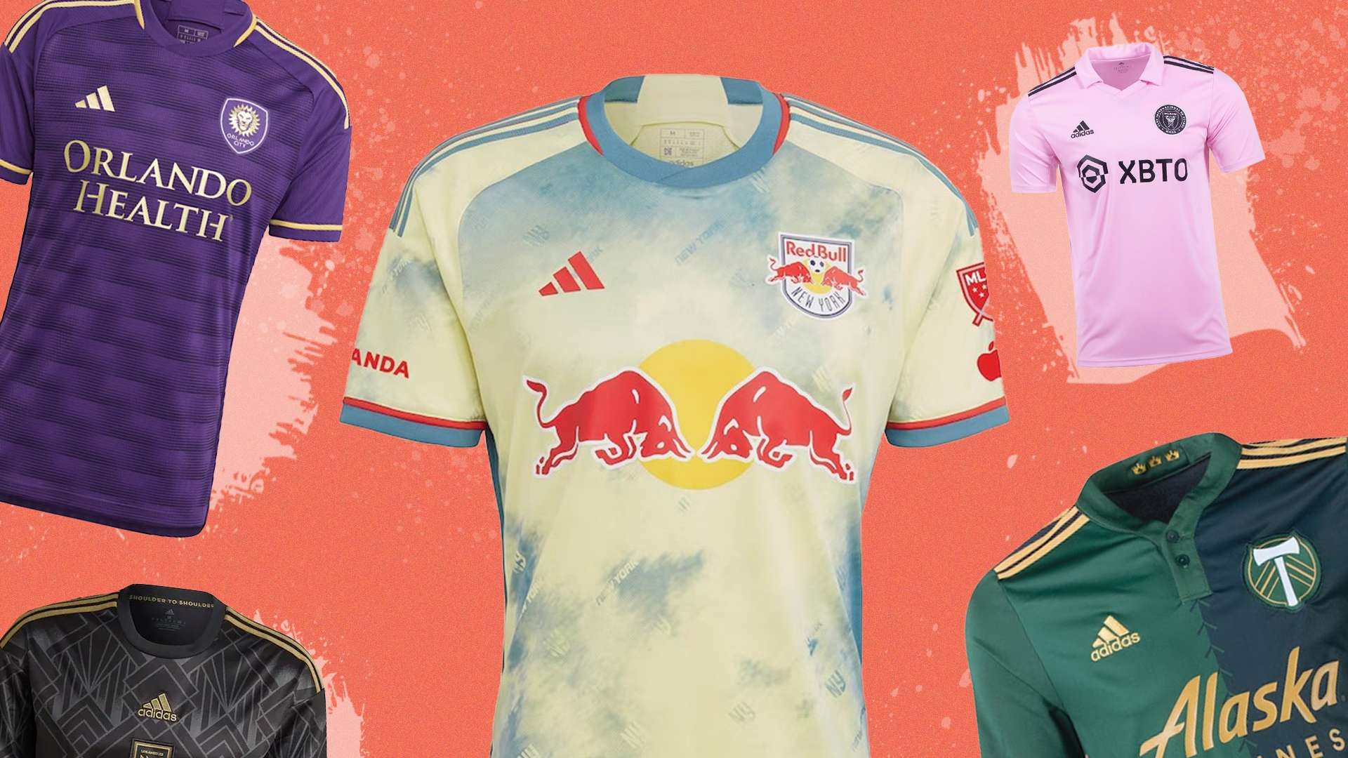
A lot has changed in the MLS since LAFC took home the MLS cup in November. There’s a new team in the league, new players from the Premier League, Bundesliga and more, and a whole new set of kits.

Watch Major League Soccer on Apple TV with an MLS Season Pass

While some teams are due to wear carryover designs this season, 28 of the 29 clubs have not confirmed which adidas-produced design they will be wearing for the 2023 season when it begins this week.

So, as the 2023 MLS season gets ready to kick off, here is everything you need to know about every team’s home shirt and, most importantly, a ranking of all of those designs. Plus, we've found links for all these shirts so you can get kitted ahead of matchday.

If you want a look past kit designs, check out our list of the best MLS home jerseys of all time.

  • MLS 2023 Home Kits Ranked

    After winning last season’s MLS Cup, Los Angeles FC have carried their kit over for the 2023 season. Who can blame them? The black and gold colour scheme of their badge helps cement the shirt as a modern MLS classic, while the ornate detailing helps to evoke the golden age of Hollywood and the glamour of the club’s home city.

  • Advertisement
  • Austin FC have given their black and green stripes a more design-forward update for the 2023 season. The various sets of stripes come in different thicknesses and orientations, with various sections across the entire shirt. There aren’t many ways that you can improve straightforward stripes, but Austin FC have found a way to bring the standard football design into 2023.

  • For the 2023 season, Portland Timbers are keen to show the bond between fans and club. To do that, they’ve recreated their signature green kits into the Portland Plaid pattern, which brings together different shades of green to create a tartan effect. The whole design is nicely finished with a gold trim around each sleeve and the collar.  

  • The design for San Jose Earthquake’s home kit takes its inspiration from the club’s name and its location. The black pattern that runs across the blue base is a nod to the fault lines of California, which is also the reason behind the “Fight to the End” text that also appears on the shirt. It is also a marked improvement on the club’s 2022 kit, which underwhelmed with its solid blue design.

  • Orlando City have chosen to honour their fans for the 2023 kit, with a design named after “The Wall” section of supporters at each home game. The tribute to the fans is shown through a subtle pattern that runs across the kit, but it’s Orlando City’s purple and gold colours that really elevate the design.

  • Another carryover from the 2022 season, Inter Miami’s pink kit plays things safe. The club is lucky that the colour combination – bright pink with a black trim – is one of the best in the league. There’s always the outside chance that this will be the first MLS kit worn by Lionel Messi, if he makes the move stateside at the end of the Ligue 1 season.

  • It’s hot and sunny in Houston, and that’s the basis for the club’s “El Sol” kit for the 2023 season. While it’s easy to see it as just a plain orange kit, the pixelated pattern made up of two slightly different shades adds another element to the design. It’s all finished off with a black trim, which complements the orange perfectly.

  • Seattle Sounders brought their blue trim to the front and centre for the 2022 season, and they’re keeping the kit for the 2023 season. The mosaic print is a nod to the fans – who created a special mosaic for the Sounders’ MLS Cup win in 2019 – and is designed to celebrate the connection between supporters and team.

  • The graphic that runs across the middle of FC Cincinnati’s 2023 kit is the key to the design’s “River” name. It’s inspired by the Ohio River that runs through Cincinatti, and is a key symbol for the city. The black river graphic is complemented by the club’s traditional blue and orange colours on the rest of the shirt.

  • Is that just the Spain kit? It’s a legitimate question about the red, yellow and blue of Real Salt Lake’s 2023 home shirt, and the colour palette recalls the “Real” that sits at the start of the name. Despite those comparisons, the kit is a clean and effective design, and works well in the “Claret and Cobalt” colours of Real Salt Lake.

  • Gone are the days of New York Red Bulls playing in white and red. The new era begins with a new shirt, showcasing the colours of bright yellow, red and teal, in a tie-dye style pattern. It’s an eye-catching move from the club, and it would score even higher if it weren’t for the big Red Bull sponsor’s logo.

  • Once again, LA Galaxy returns to its white, gold and navy colour palette – one of the strongest and cleanest in the league – for the 2023 season. The design is pretty simple, but is transformed into something more exciting by the gold star motif that runs along the collar and around each sleeve.

  • Arguably the stand-out feature of Colorado Rapids’ home shirt is the colour combination, and the club is blessed with its burgundy and blue colour palette. The shirt also references the team’s mountainous home state with an abstract pattern inspired by the peaks and 5,280 feet of elevation. It’s a simple design from Colorado Rapids, but perfectly elevated into something more interesting.

  • Over the years, New York City FC have tried numerous ways to break free of their sky blue likeness to Manchester City, generally through the use of orange detailing. That returns this time – in the form of a trim around the collar and sleeves – but the highlight is the huge tonal mosaic depicting the club’s logo. The mosaic is a nod to New York’s subway stations and the ceramics on show.

  • Leaving the huge gold Bimbo logo to one side for a moment, Philadelphia Union’s home shirt isn’t bad. The design mixes the two shades of blue nicely, and the off-centre stripe is a nice detail. Tying it all together is the gold trim, which makes for a regal design from last season’s Eastern Conference champions.

  • Making their debut as the newest MLS expansion team, St Louis City are keen to make an impact. The club have gone with a half-and-half design for their pink shirt, with one side featuring darker-coloured stripes. The design gets extra points for the use of colour, with the bright pink offset by navy and yellow detailing.

  • A red shirt with navy hoops might not be the easiest sell, and FC Dallas have tried to tweak it numerous times in the past. The 2023 design, which is the same as their 2022 kit, might be the best attempt yet. The hoops are transformed into a diagonal stripe pattern, which slowly fades away as you near the bottom of the shirt.

  • As a carry over from the 2022 season, it’s easy to know what to expect with Chicago Fire’s home shirt. Its case isn’t helped by the straight-down-the-middle design, with the navy base finished off with a contrasting red trim. The only real detailing comes in a subtle pattern inspired by the architecture of the city. It’s nothing special, but there are much worse.

  • While some teams have completely reinvented their identity ahead of the 2023 season, Sporting Kansas City have opted for a subtle progression. Their light blue and navy hoops return for this season, with the addition of a single button collar being the only notable addition. While not a bad kit from the Wizards, it’s a pretty safe design.

  • Another MLS newcomer – 2023 is Charlotte FC’s second season in the division – they’ve carried over their debut design into the new season. It’s a pretty safe and uninspiring choice with a bright blue shirt and white sleeves. The trim around the collar is nice, but not enough to save Charlotte FC from the lower reaches of the table.

  • The Minnesota United kit isn’t really up to much. Like other designs in this season’s MLS, it’s saved by its colour combination and, in particular, the bright blue trim. It was brought in for the 2022 season as the club scrapped its traditional grey and blue colours, although the black replacement hasn’t lived up to its billing yet.

  • The Vancouver Whitecaps navy band has become a signature of the Canadian club’s kits, but this season it’s letting the side down. The introduction of a dark red trim on the band clashes with the thin light blue stripes, and makes the front of the shirt look too busy.

  • After experimenting with a black shirt and five thin stripes for the last two seasons, Atlanta United have reverted to type for 2023. Unfortunately, the return to classic red and black stripes is a downgrade on the more interesting and progressive design that the club adopted for the 2021 and 2022 seasons.

  • Columbus Crew’s 2022 shirt was underwhelming, and it remains so for the 2023 season. The only detailing used – an isometric checkerboard pattern – is too subtle to add much to the kit, meaning it’s just a yellow shirt with a black trim, really.

  • With its black base, tonal stripes and slight red trim, the DC United home kit has been criticised for its simplicity in the past. By keeping the same one for the 2023 season, the club are opening themselves up for the same criticisms. It feels like an underwhelming design for Wayne Rooney’s men, who finished bottom of last season’s Eastern Conference (and the league overall).

  • Another design that suffers due to its simplicity rather than any major flaws, the New England Revolution home shirt also fails to live up to its billing. At the end of the day, it’s a navy shirt with a white and red trim, and not much else. There’s a very faint tonal pattern, but it doesn’t contribute to the design.

  • There isn’t much to report for Nashville SC’s home shirt. It’s a carryover from the 2022 season, and once again plays it safe with a bright yellow base and dark navy trim. There’s a bit of detailing – in the form of a soundwave pattern up each side – but overall, it's another lacklustre design from Nashville.

  • After years playing primarily in red, Toronto opted for a change this season. The design is a nod to the 2018 Treble winning season, with the Onyx grey moving from subtle trim to main attraction. Unfortunately for the Canadian team, the design doesn’t quite reach the same standards as the champions of five years ago.

  • CF Montreal were unable to release their home kit in time for the 2023 season due to an ongoing consultation over the inclusion of an inscription in an Indigenous language. The leaked images show a black and blue design not too dissimilar from the San Jose Earthquakes design, which is sure to prove popular when the Canadian club belatedly unveil the shirt.